Wasps Cycle Club

Taking Inspiration from Nature's Design System
When Wasps Cycling Club launched a competition to redesign its team jersey, I explored how the defining characteristics of a wasp could be translated into a contemporary performance kit. Rather than relying on literal illustrations, the challenge became one of abstraction—capturing the energy and identity of the club through pattern, form and colour.
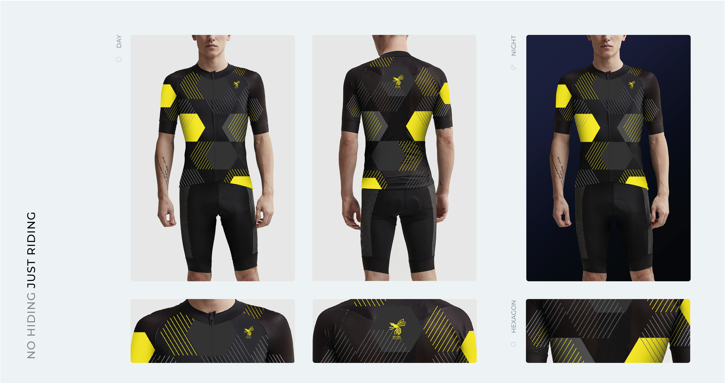
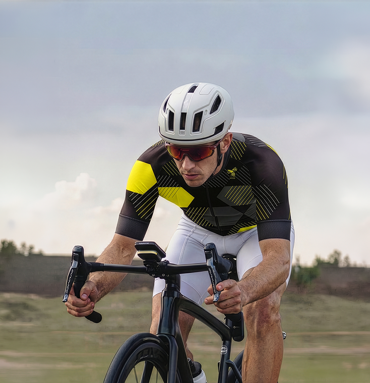
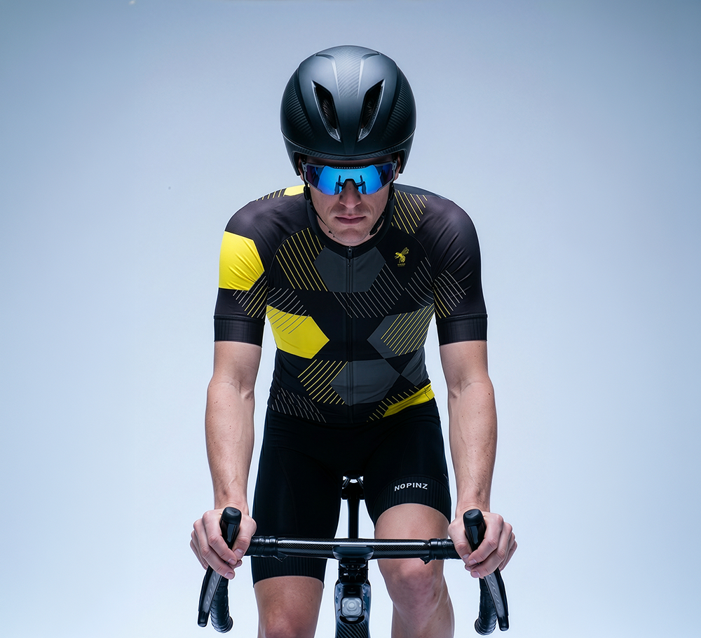
Two concepts emerged from the exploration. The first drew inspiration from the distinctive black and yellow markings found on a wasp's abdomen, transforming the familiar 'V' shapes into a dynamic geometric pattern that creates movement across the jersey. The second looked to the architecture of a hive, using abstracted honeycomb structures and overlapping hexagonal forms to create a layered visual language rooted in the natural world.
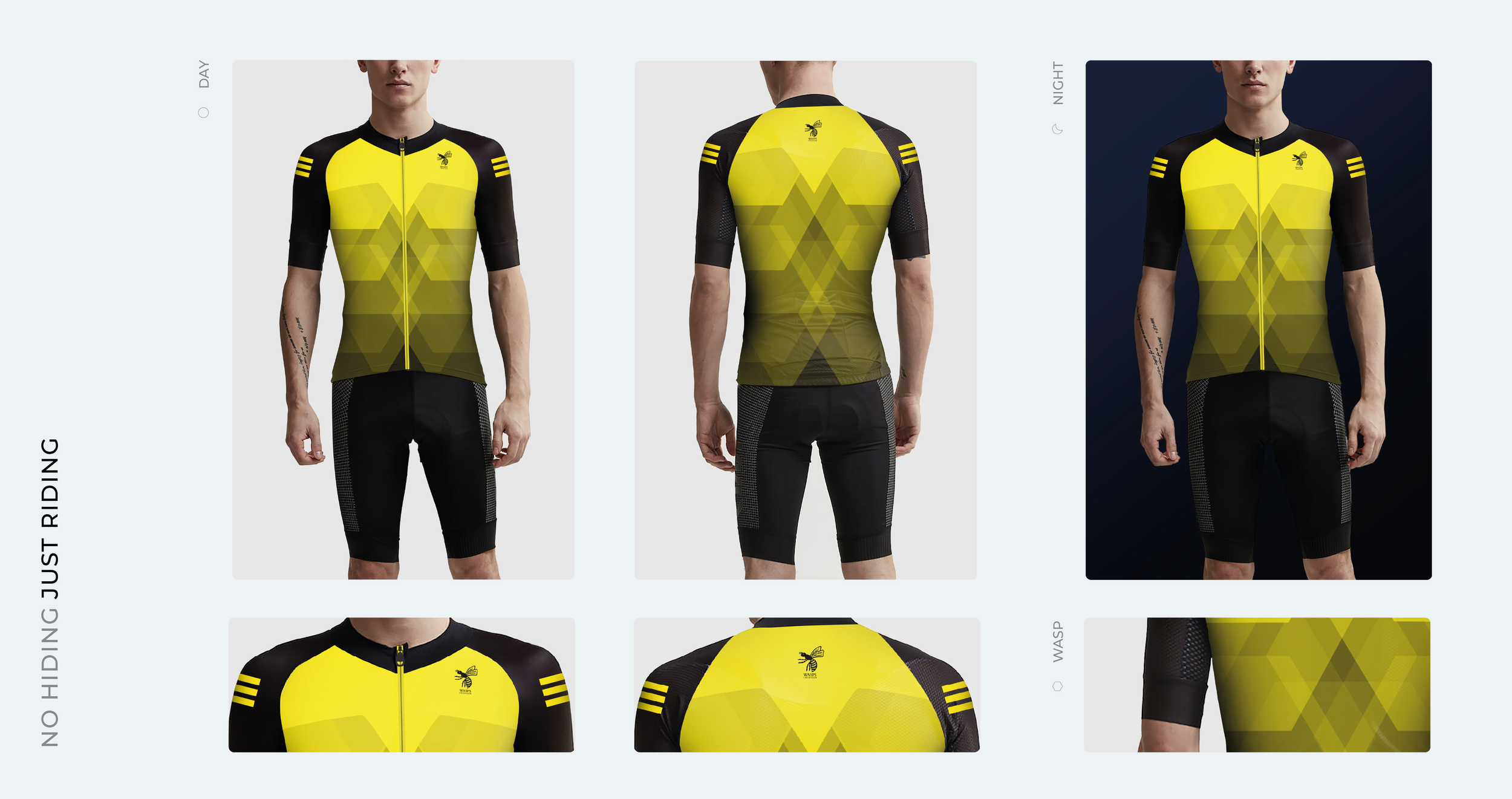
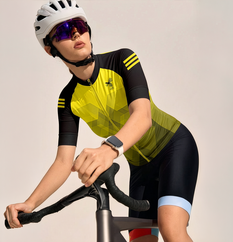
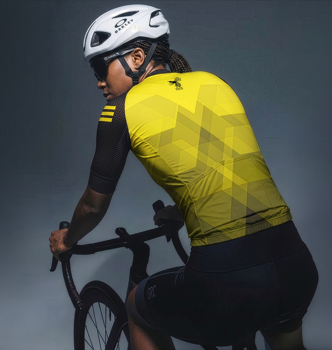

Both concepts were designed to balance team recognition with modern sportswear aesthetics. The iconic Wasps colour palette and cycling club branding remained central to the designs, while the abstract graphics introduced a more contemporary and performance-led feel.
The final proposals demonstrated two distinct interpretations of the same brand story, one inspired by the wasp itself, the other by the environment it inhabits. Both entries were recognised by the judging panel, finishing second and third in the competition, validating the strength of the concepts and their ability to translate the club's identity into a distinctive piece of performance apparel.
Performance Through Pattern