Greentarget

A mark with meaning.
A brand with purpose.
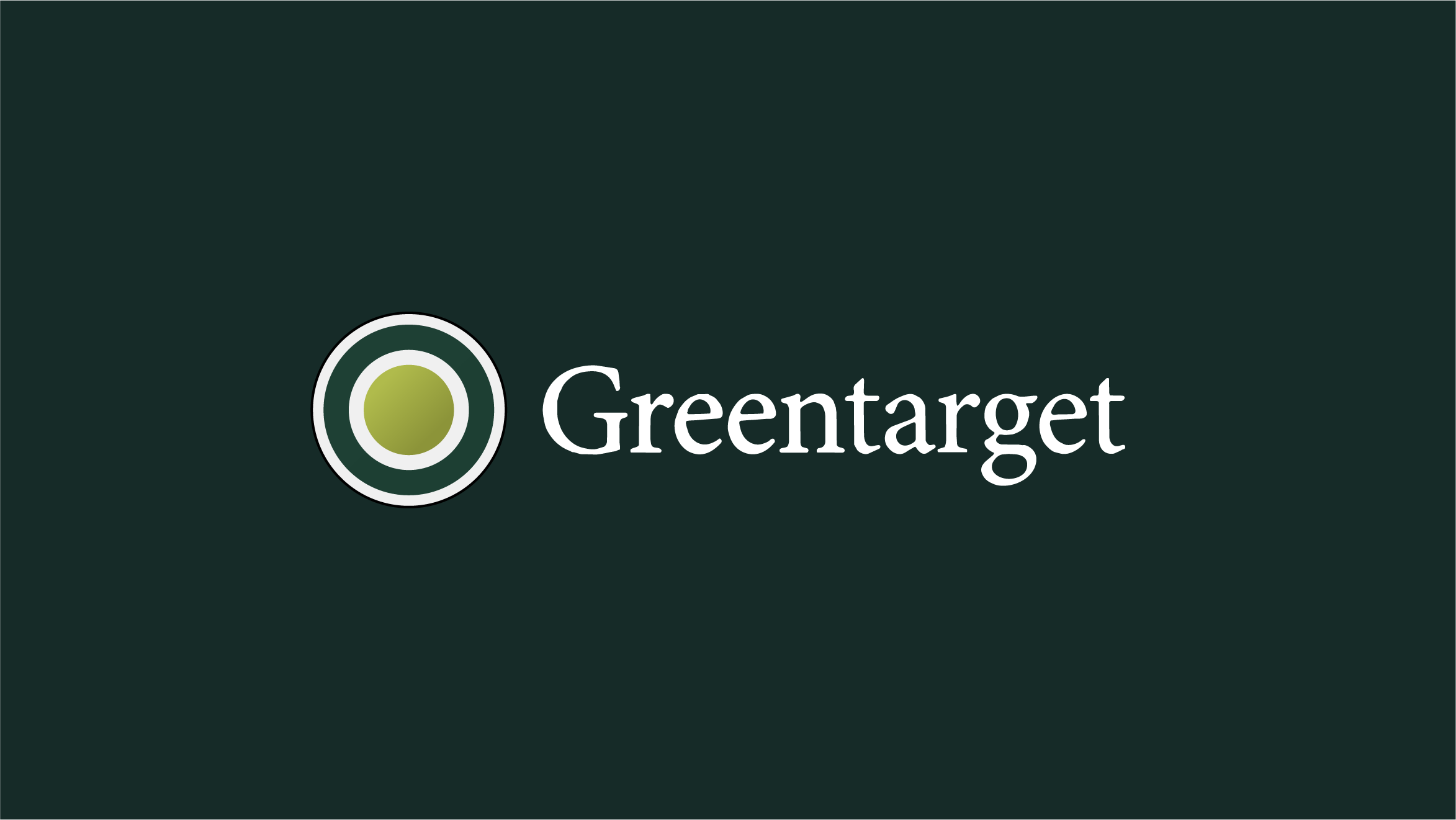
Greentarget had a logo. What it didn't have was an identity with an idea at its centre. The existing mark, a wordmark paired with a generic target icon — communicated the name but not the consultancy's character: a trusted, B2B strategic communications partner working with some of Europe's most complex companies.
The brief was to rebrand. Not to modernise for its own sake, but to build something that did what Greentarget itself does: communicate with precision. The new identity had to embody the discipline the consultancy sells, so that the brand and the business would become inseparable.
The full stop.
The point.
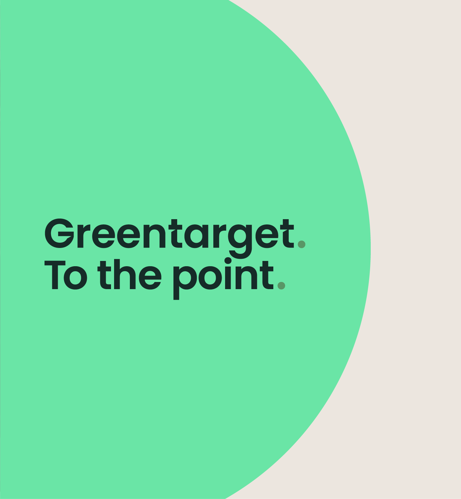
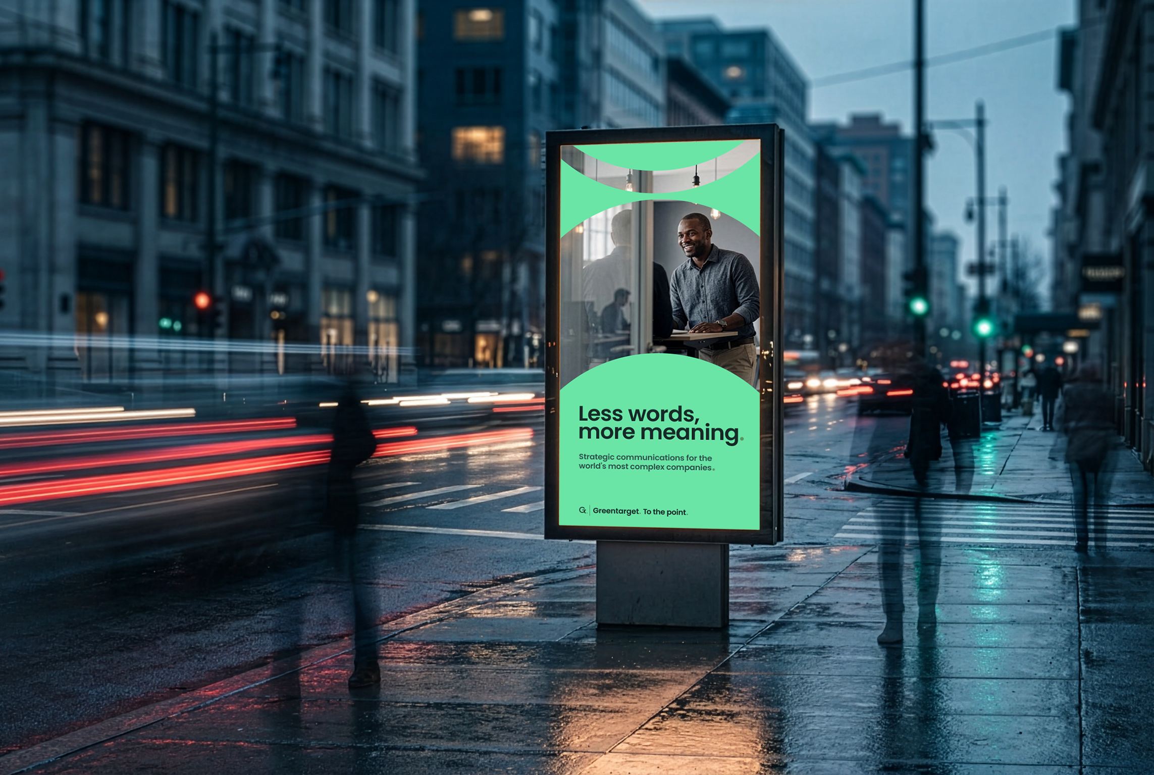
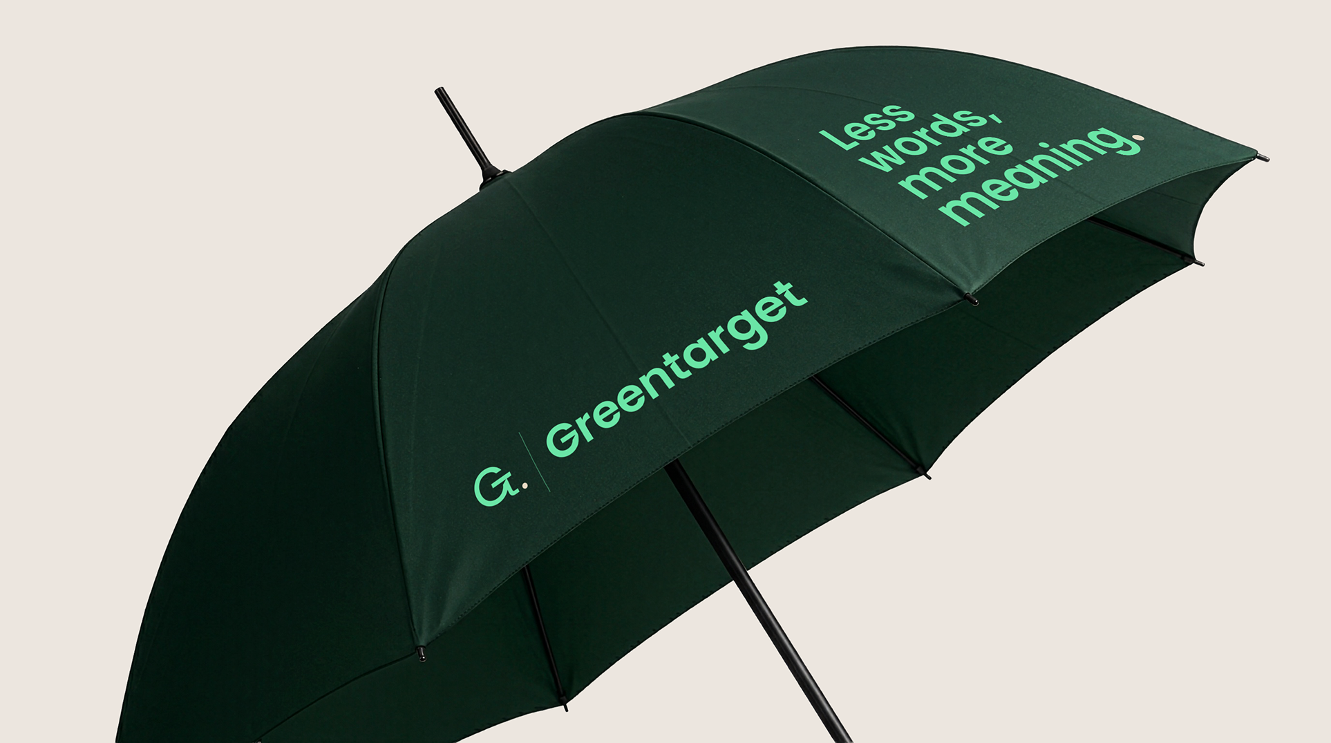
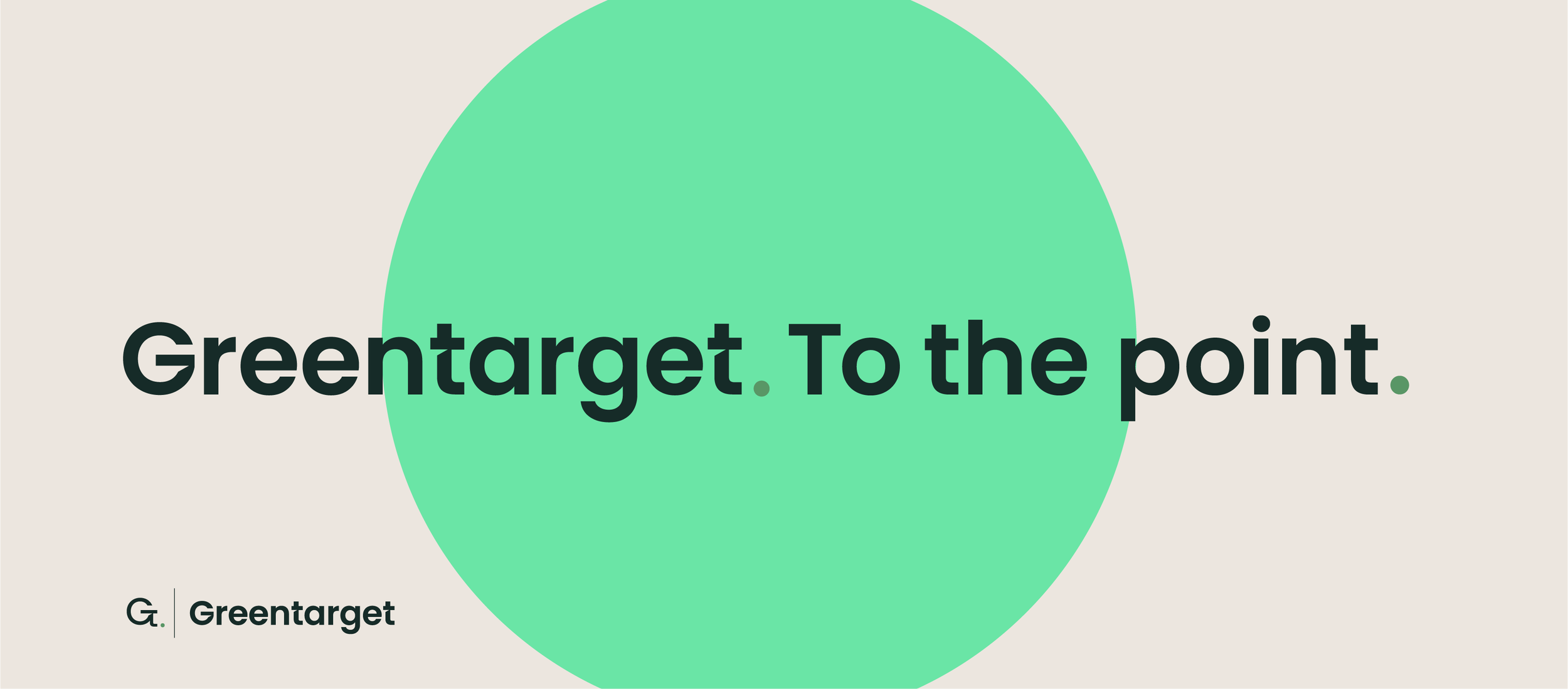
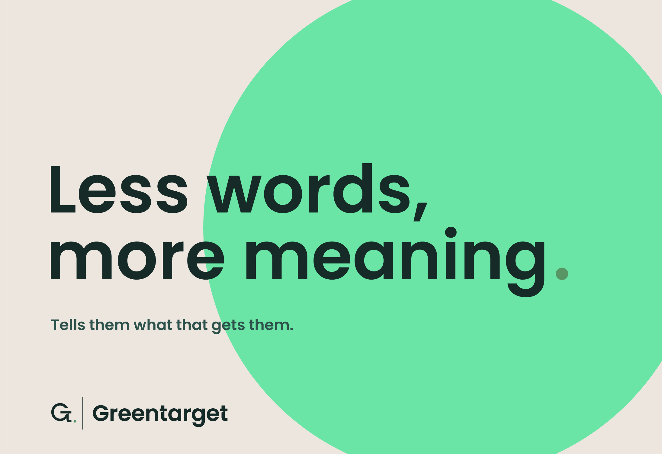
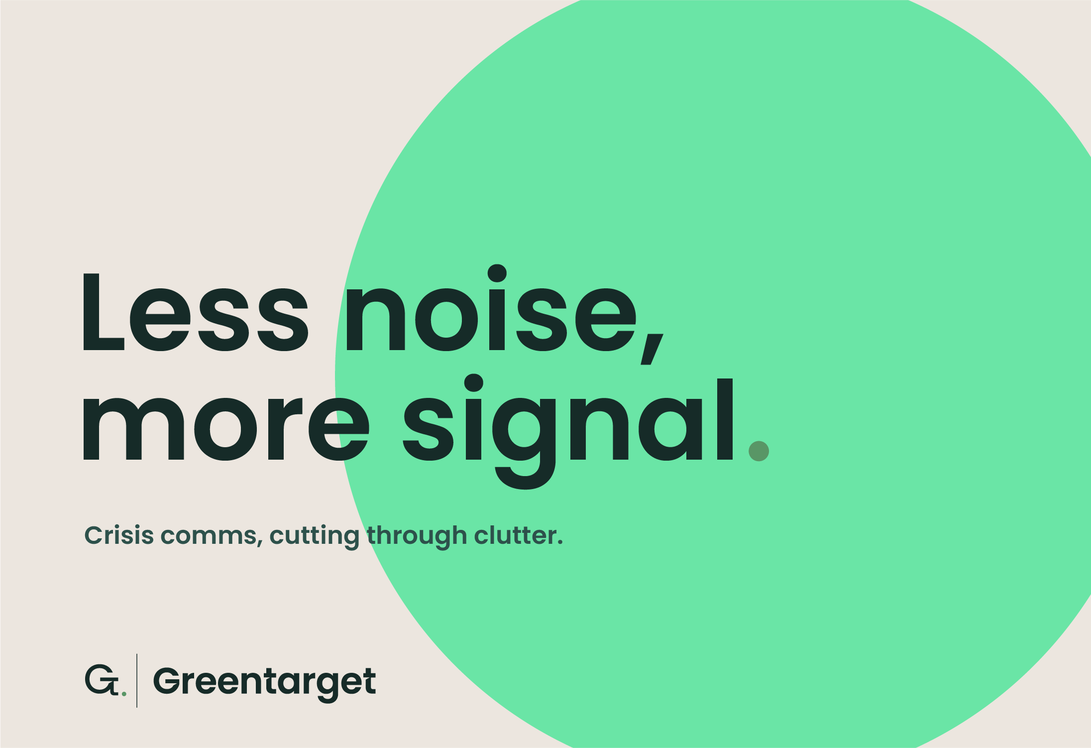
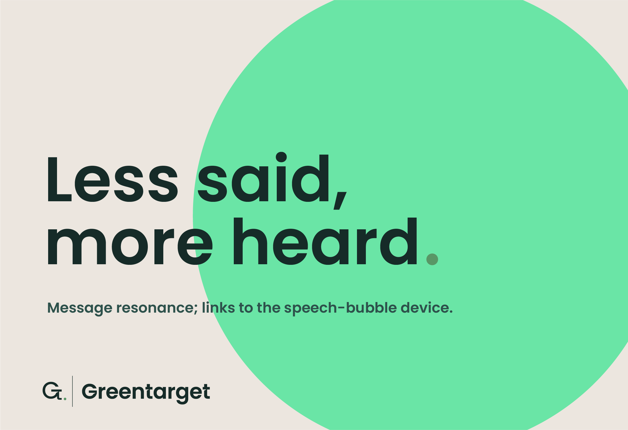
The brand line, Greentarget. To the point. uses the full stop as both punctuation and identity device, the mark ending every sentence as a quiet assertion of confidence. The supporting strapline, Less words, more meaning, unpacks the promise: clients aren't paying for fewer words, they're paying for more meaning in the words that remain.
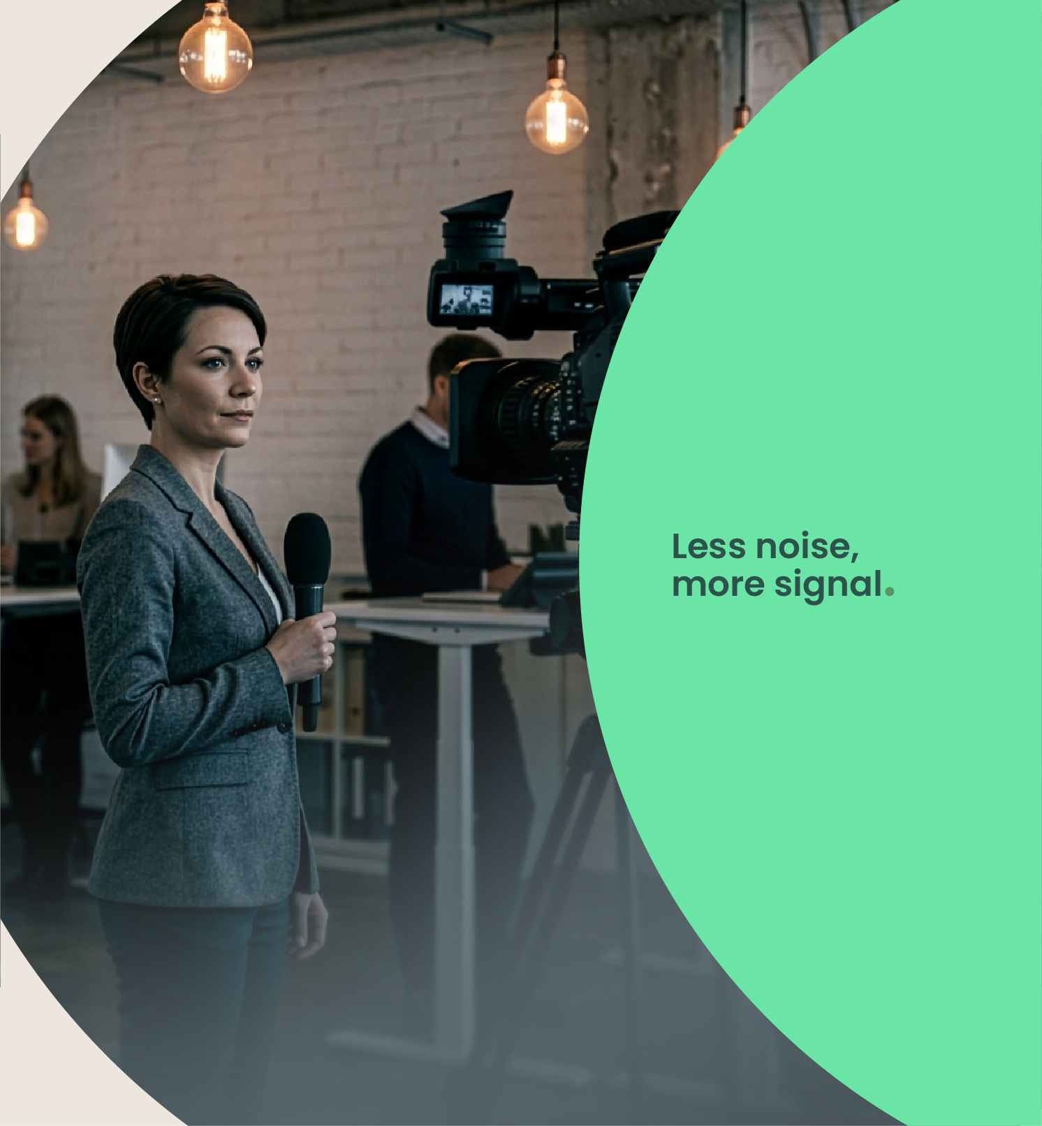
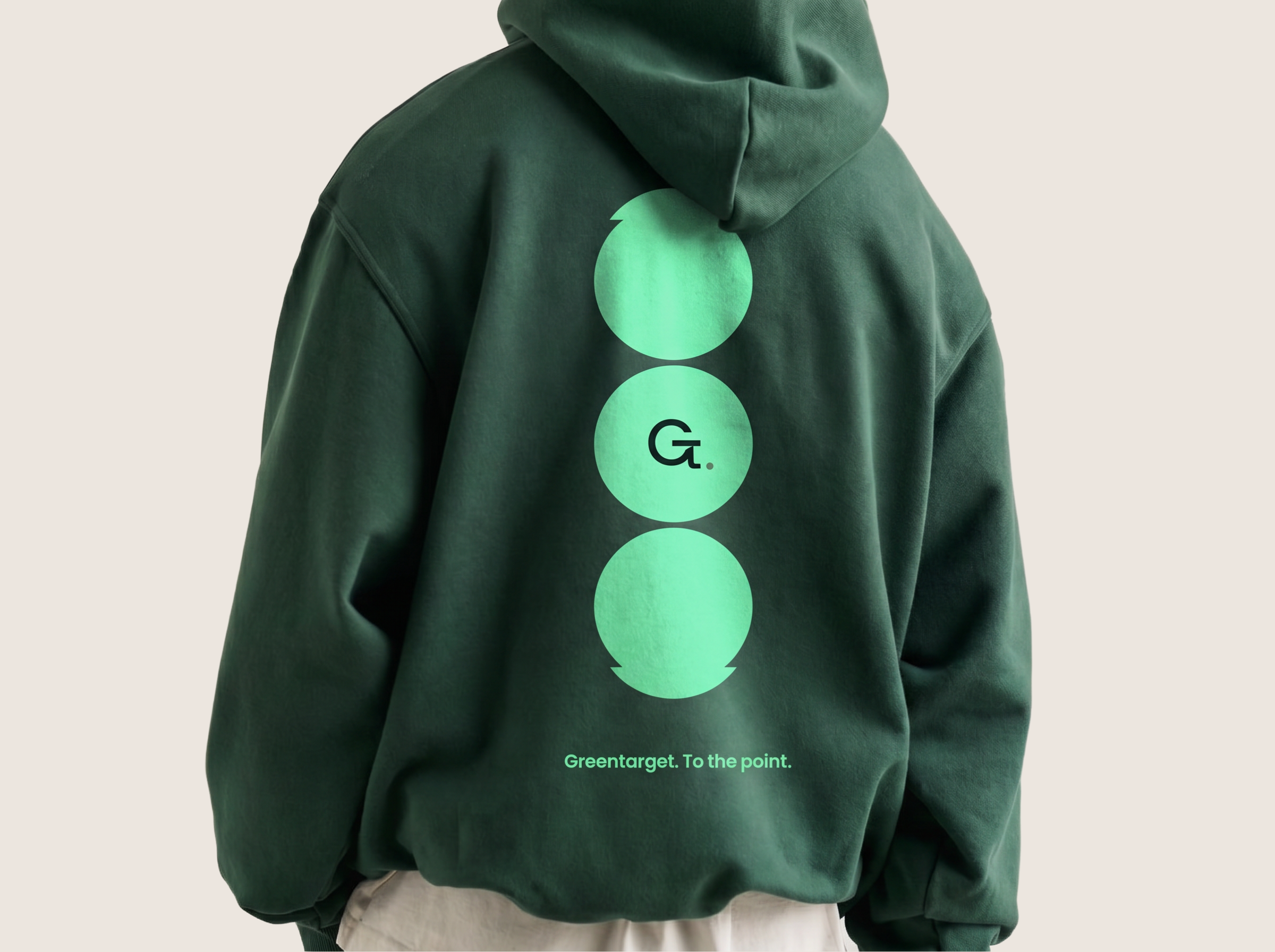
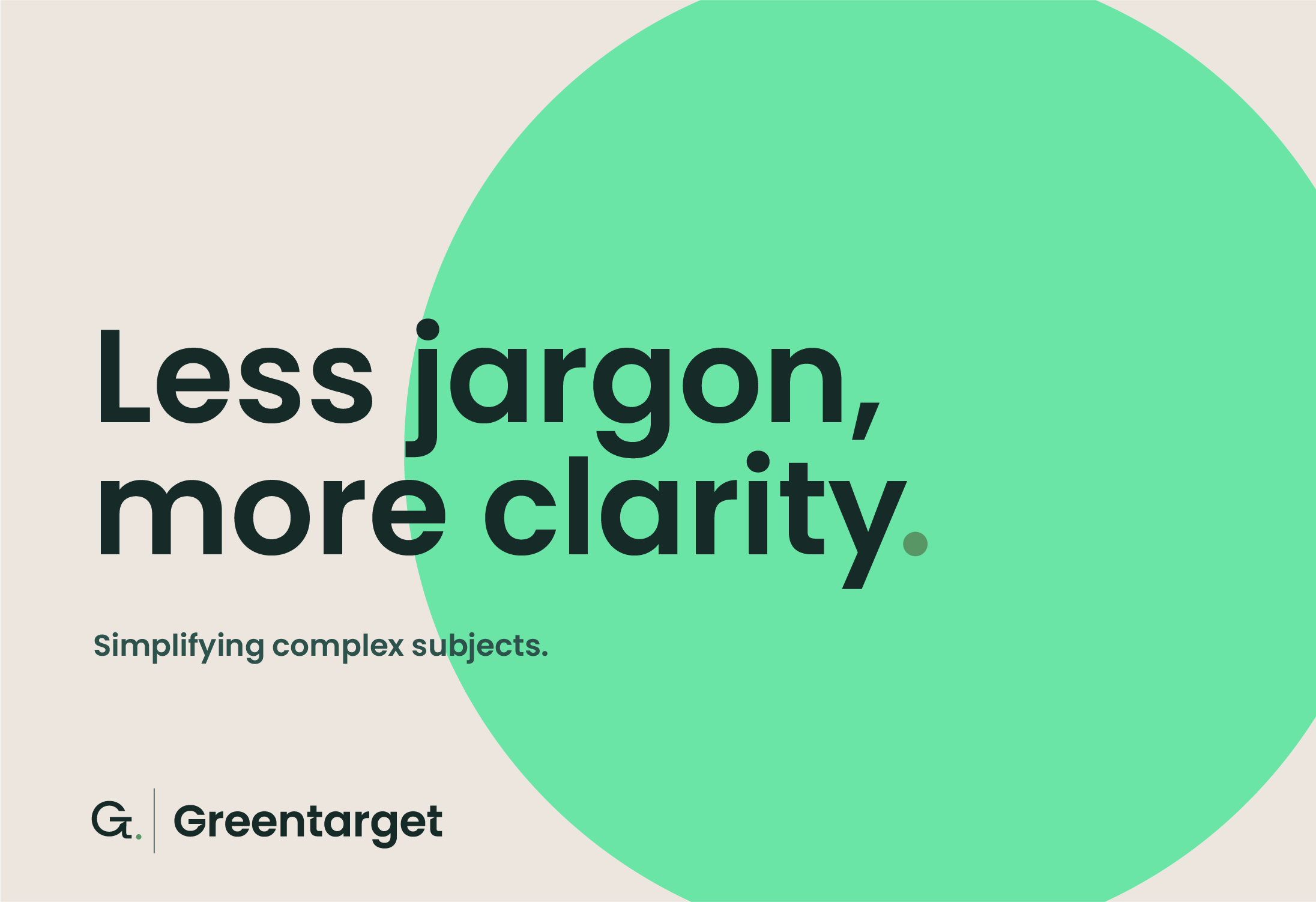
The graphic system extends the dot and speech bubble into working design devices, circular image holders that frame photography consistently across social, print, and digital; a dot used as a status indicator in reports; a sign-off mark at the close of decks and documents. An editorial design language: generous space, strong type hierarchy, the dot used sparingly as a mark of emphasis, never decoration.
The Greentarget identity gives the consultancy a brand system that reflects its own standards. Every touchpoint, from a social panel to a pitch deck sign-off, asks the same question the brand line does: have we said what needs saying, and nothing more?
By building the entire identity around a single punctuation mark, the brand earns a level of coherence most consultancies spend years trying to construct. The idea is already there, in the logo. Everything else follows.
Precision, built in.




Less said.
More landed.
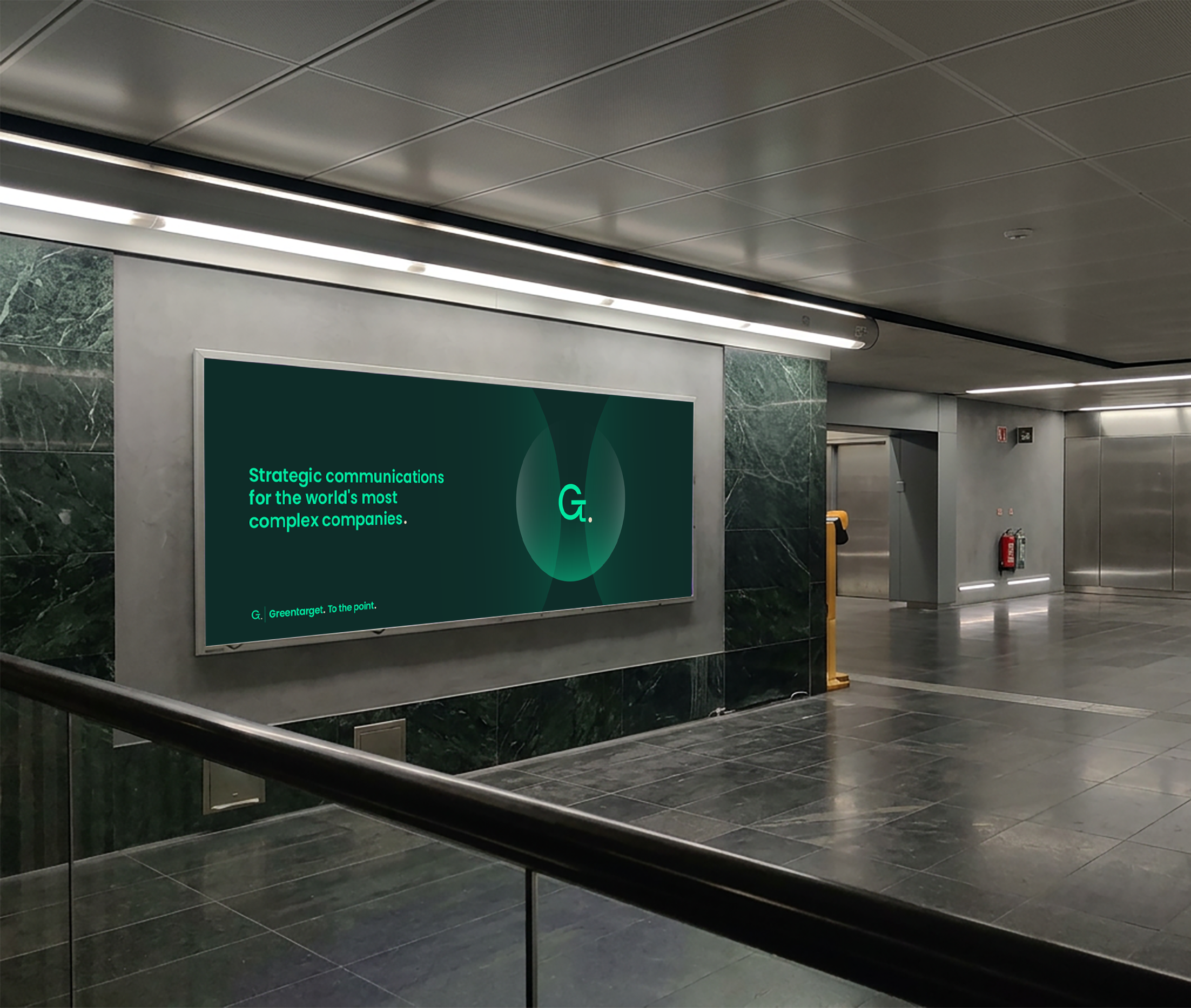
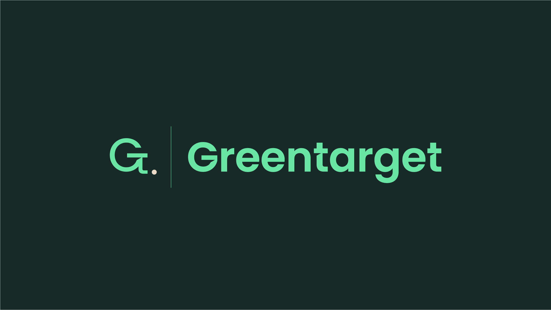
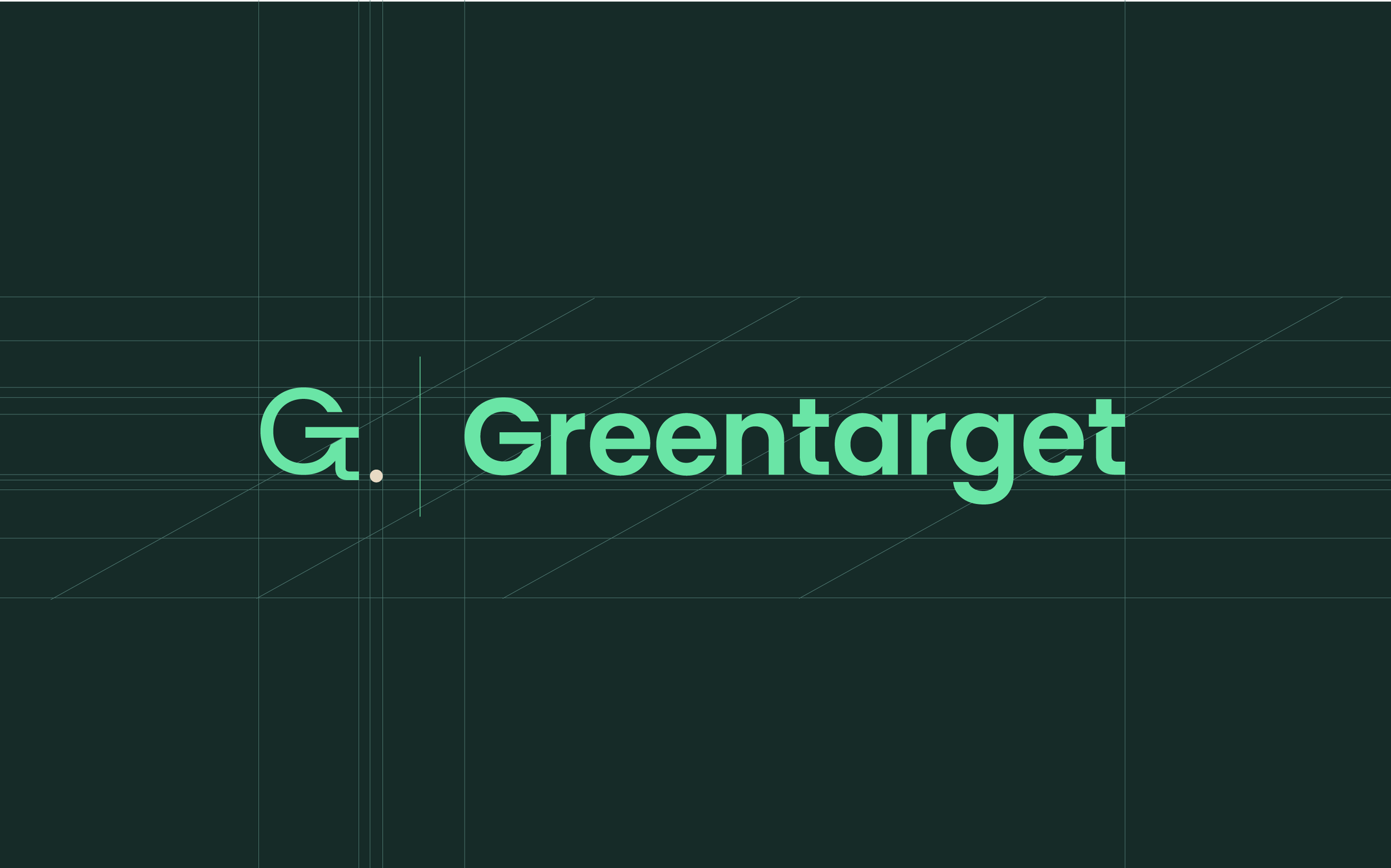
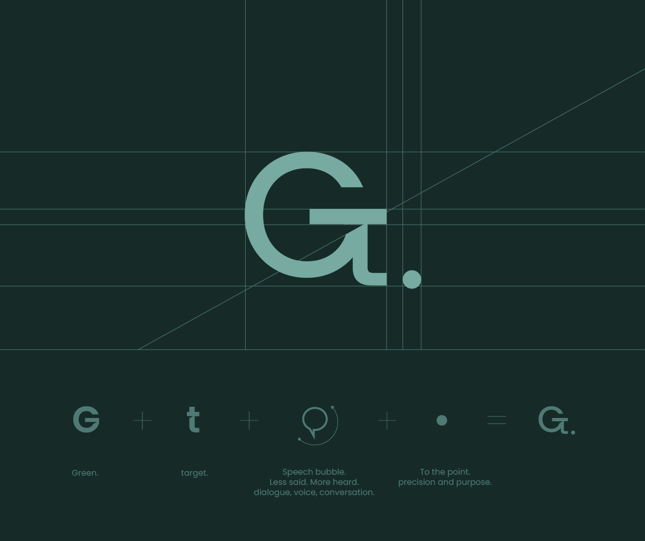
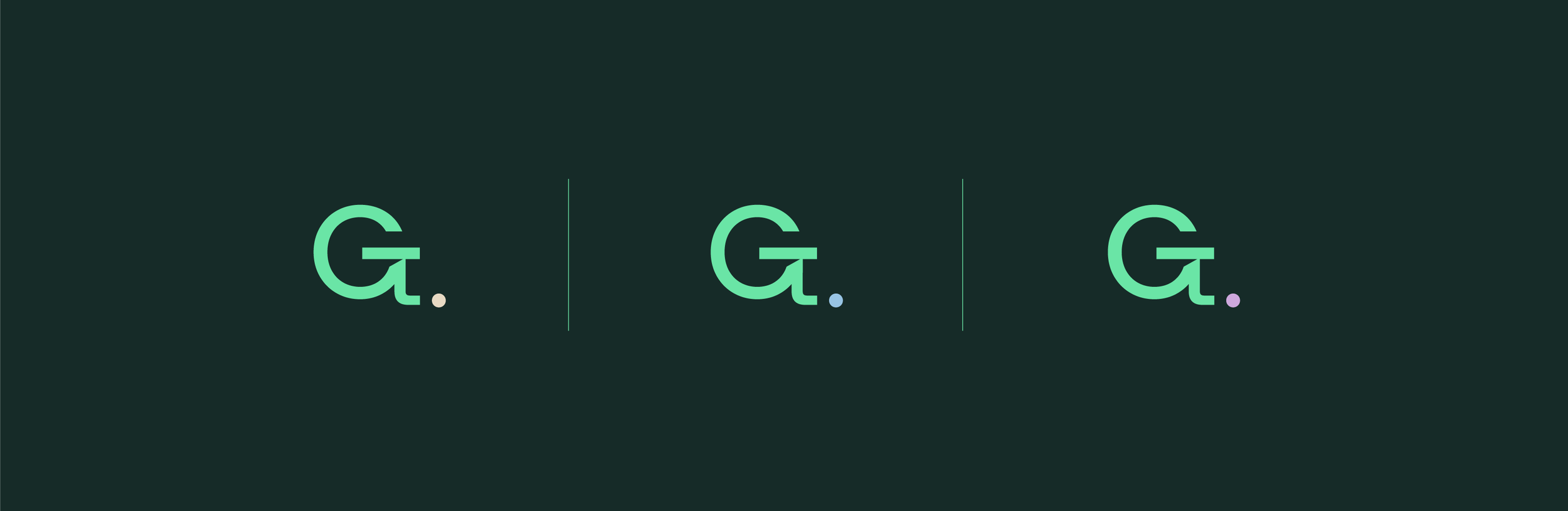
Every element of the identity flows from a single insight: the Greentarget logomark, a G and t ligature, resolves into a full stop. That punctuation mark became the conceptual engine of the brand.
The full stop isn't decoration. It's a statement of discipline. Only a consultancy confident in its advice can afford to be brief. The dot says: we've said what needed saying. The rest is silence.
Nested within the G/t construction, a speech bubble adds a second layer, conversation and voice sitting inside the logic of brevity. Precise in message. Human in delivery.