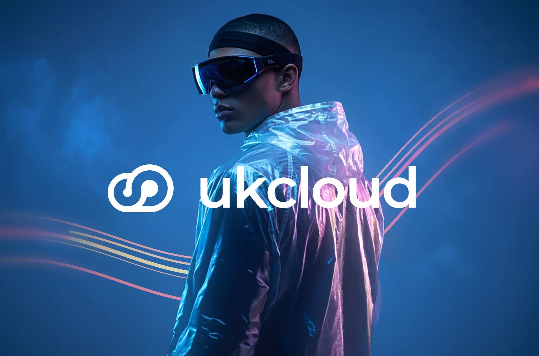
UKCloud

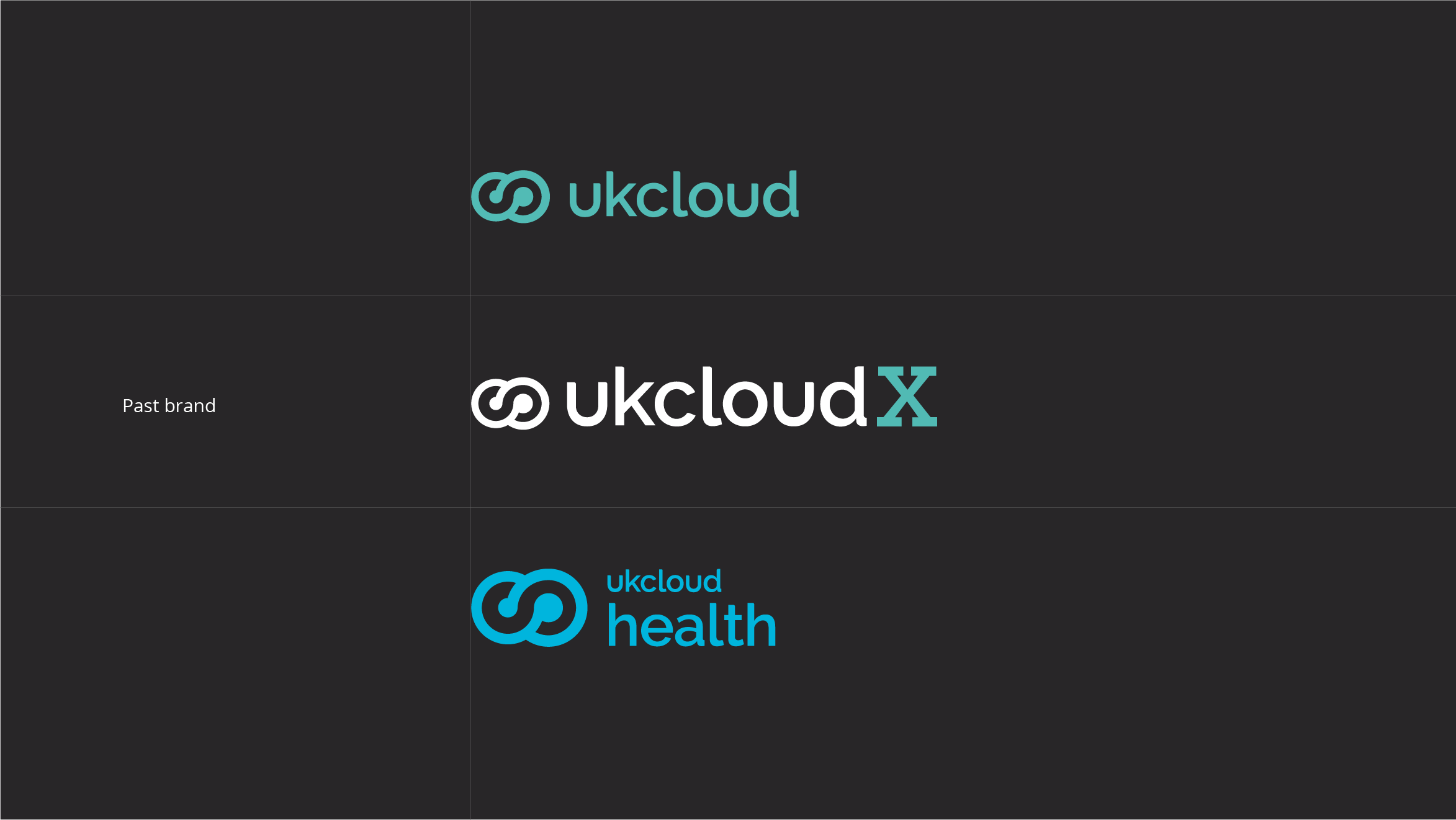
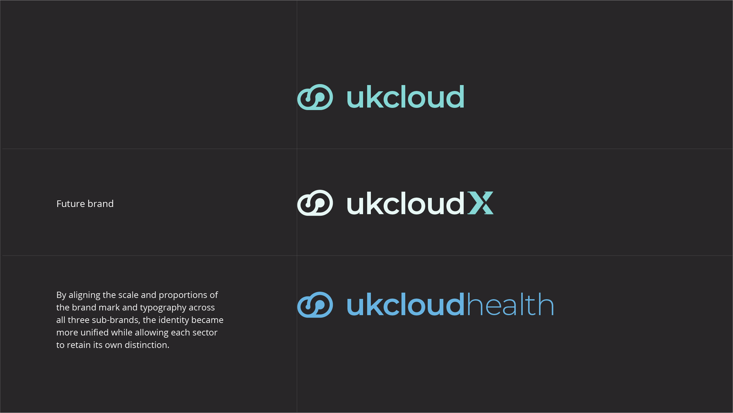
As UKCloud expanded across Commercial, Military and Health sectors, its identity needed to evolve alongside the business. The challenge was to create a more cohesive system that unified the organisation while allowing each division to maintain its own presence.
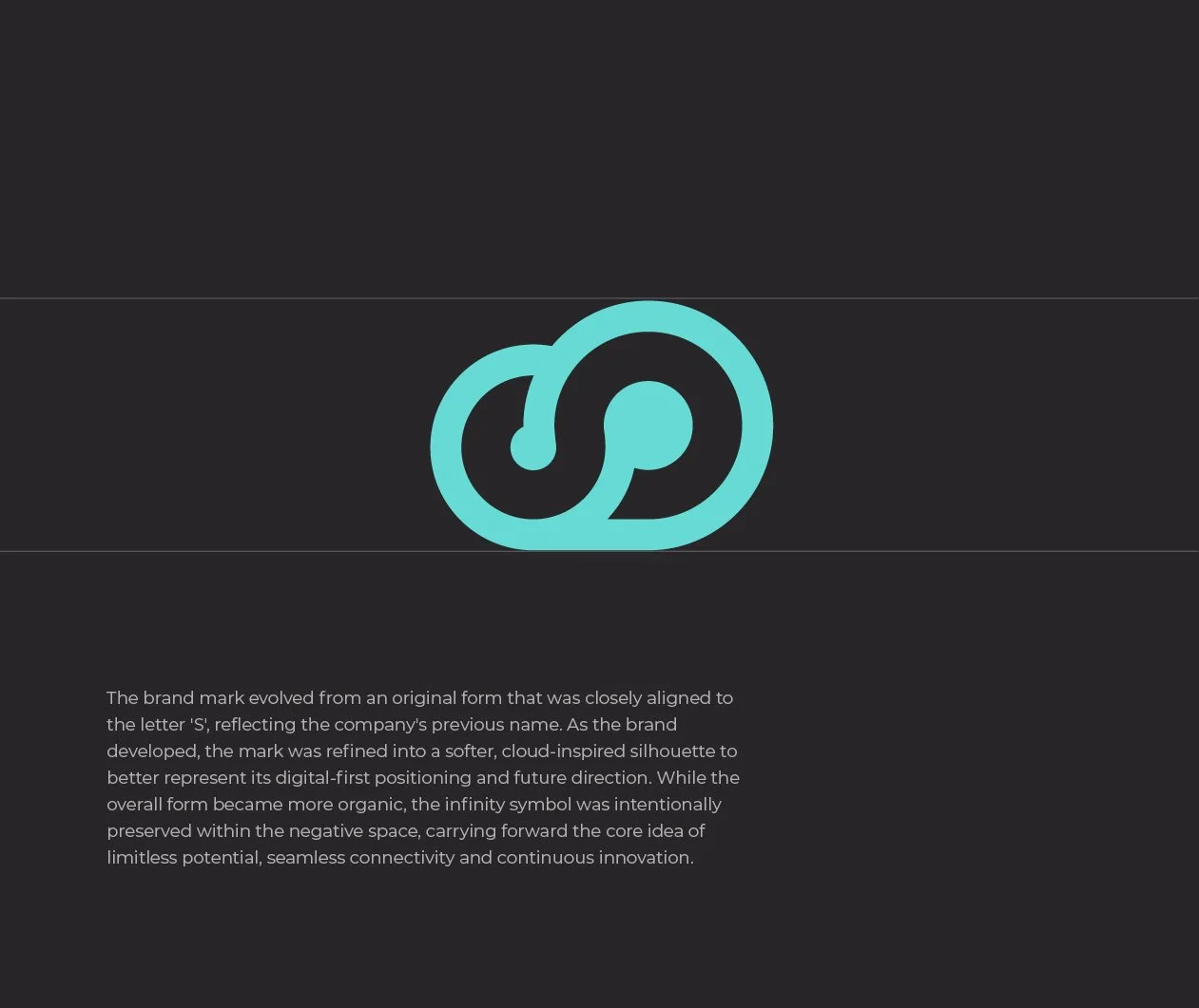
The existing infinity symbol carried strong recognition, making evolution, not reinvention, the key objective.
One idea. Endless possibilities.
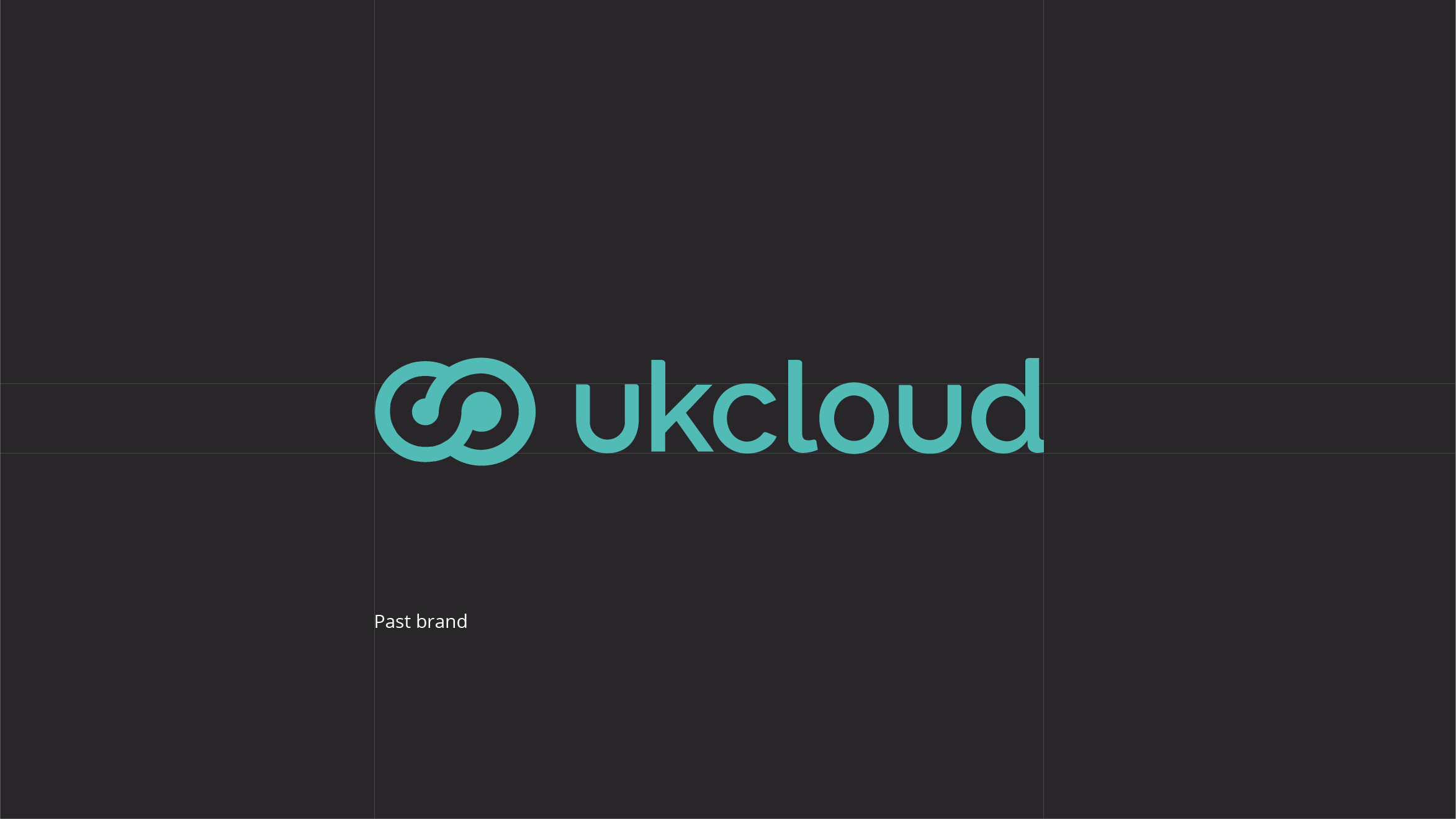
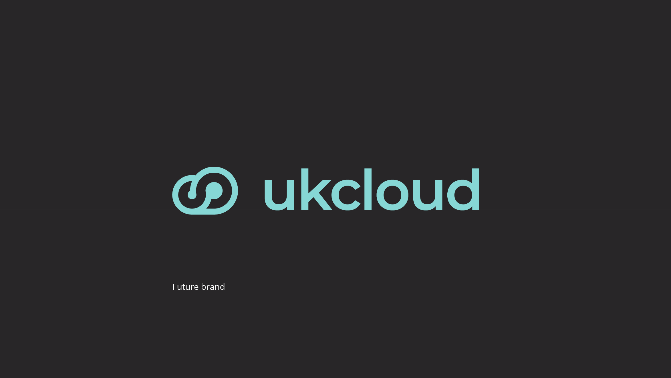
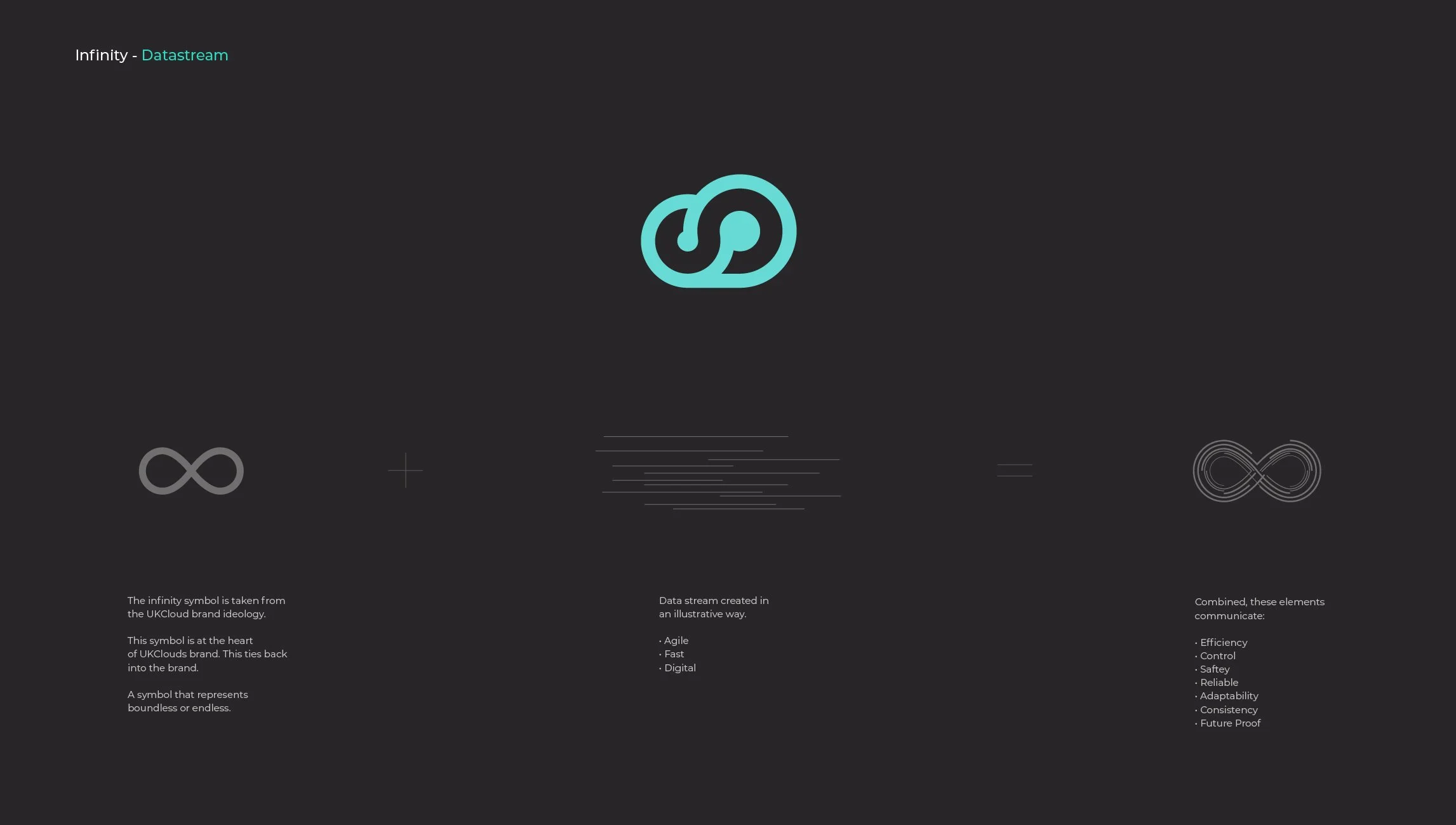
The infinity symbol represented more than continuity, it represented connectivity. Rather than replacing it, I expanded its meaning, exploring how the icon could become a visual representation of data, movement and communication across the organisation.
The goal was to transform a logo into something larger: a system capable of expressing both individual sectors and the wider business.
Connection at every scale.
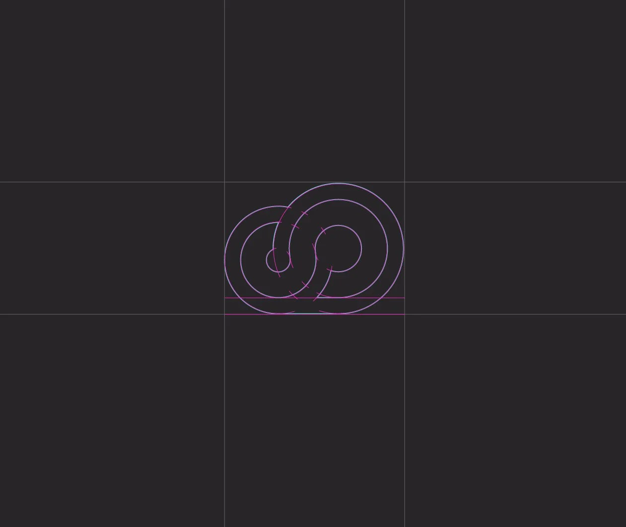
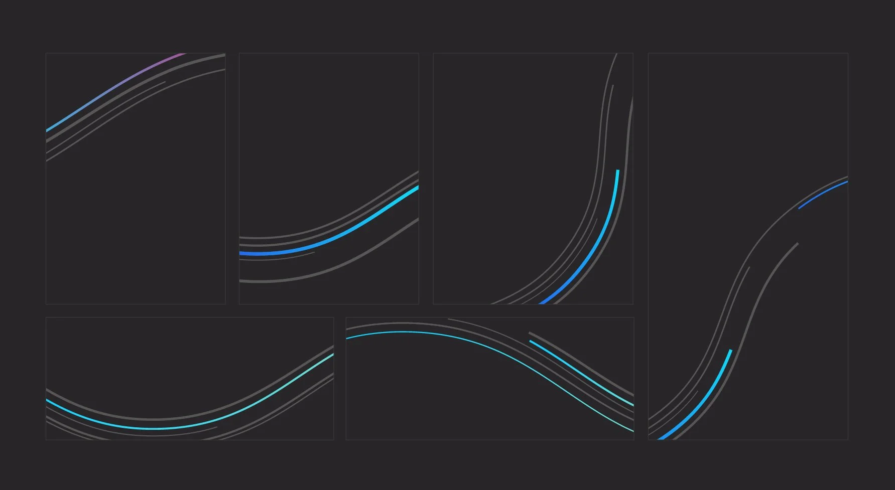
The original mark evolved into a series of flowing data streams inspired by the infinity symbol. Each stream was colour-coded to represent Commercial, Military and Health, allowing every division to communicate independently while remaining visually connected.
Working separately or merging into a single infinity form, the streams became a flexible graphic language used across branding, motion and digital experiences.
From symbol to system.
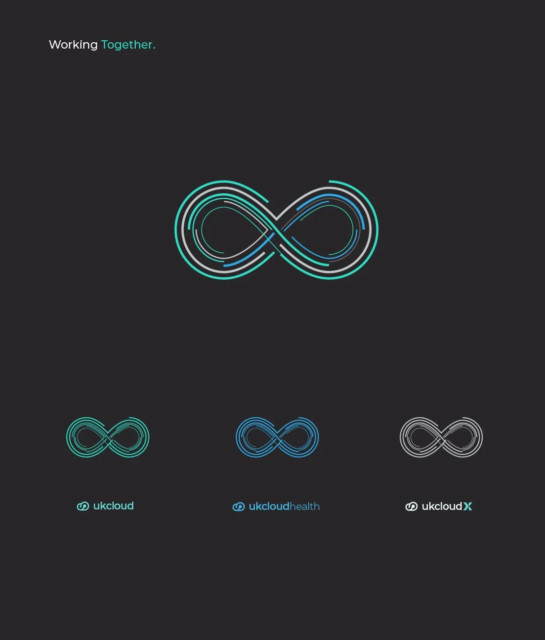
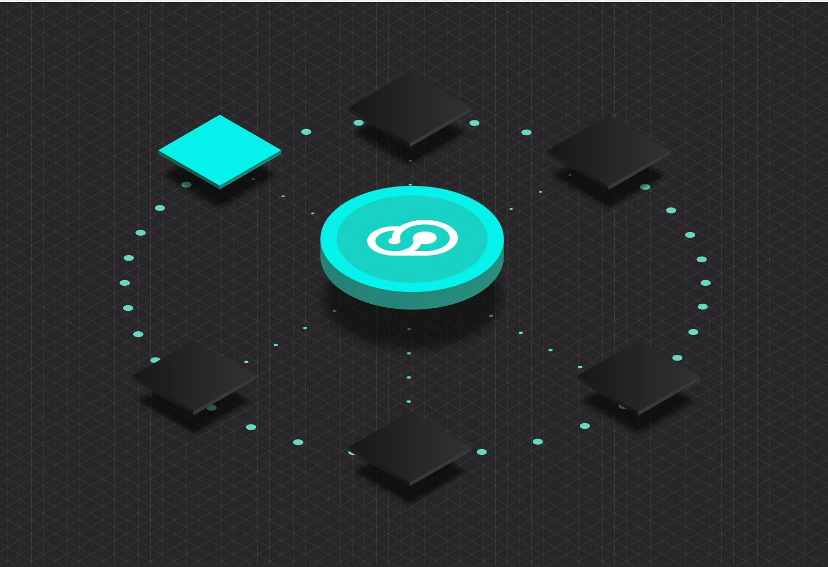
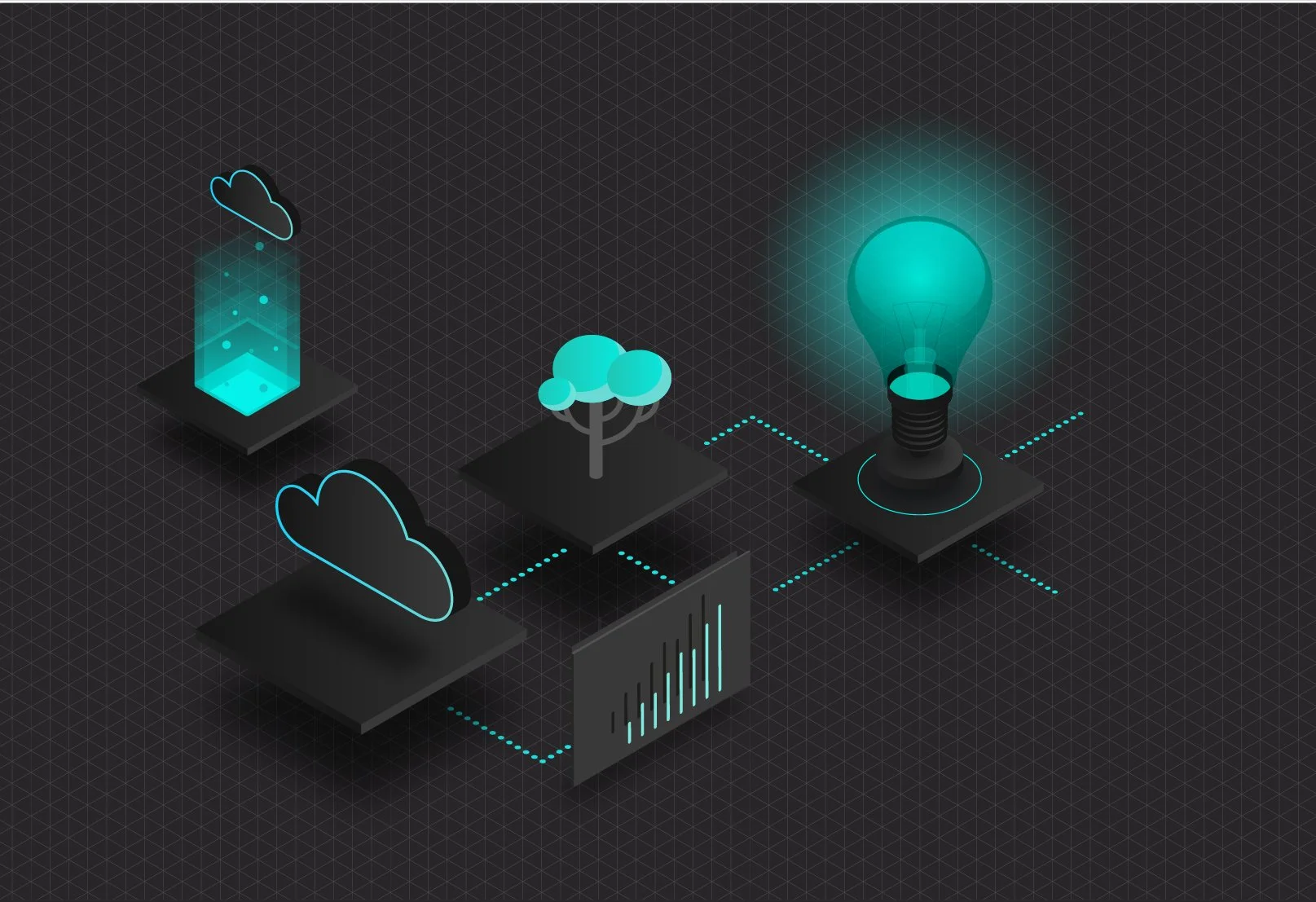
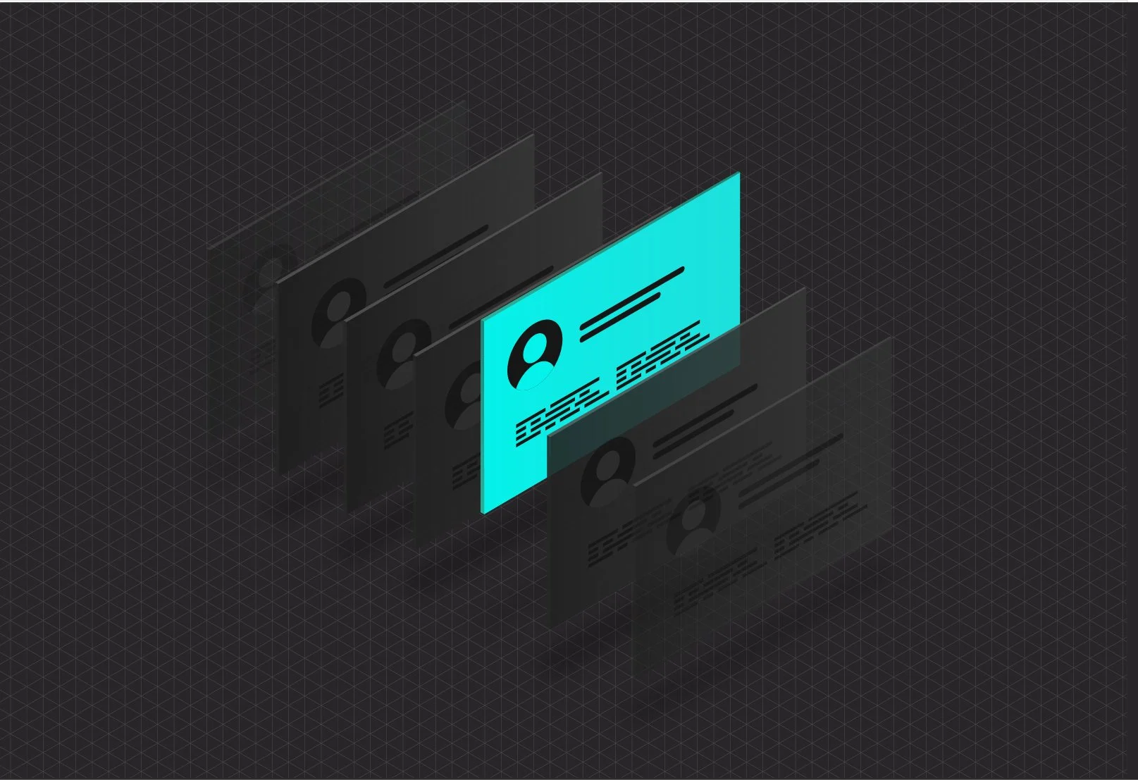
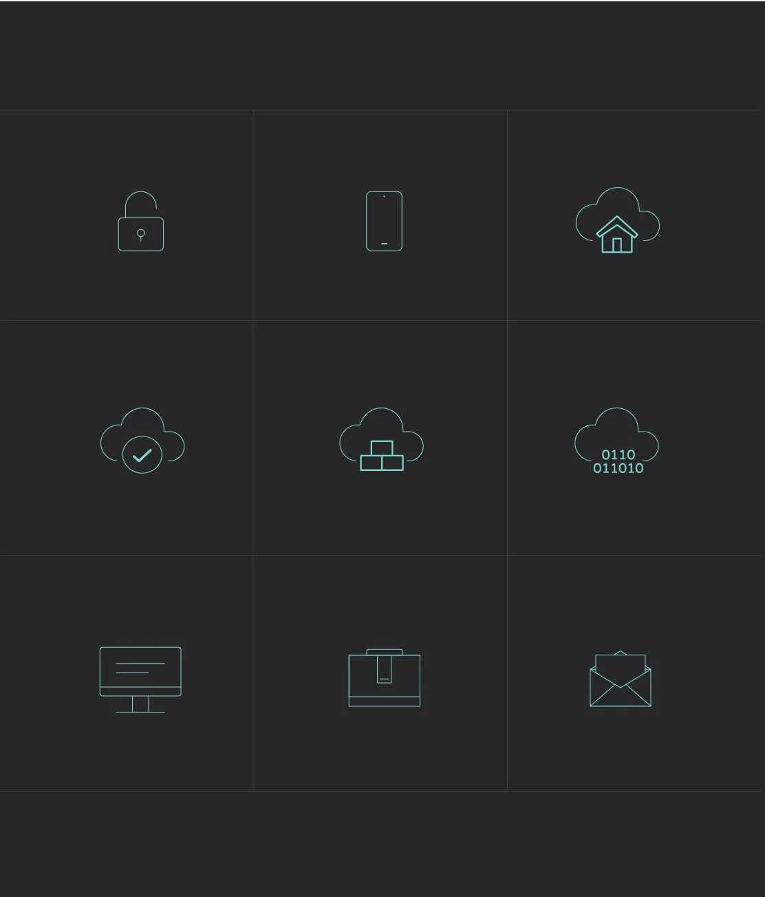
The final identity transformed a static logo into a living brand system. Through animation, digital communications and social content, the data streams created a visual expression of connection, innovation and scalability, bringing consistency to a growing organisation while preparing the brand for the future.
Designed to move.