JVB
Surrey Design Studio
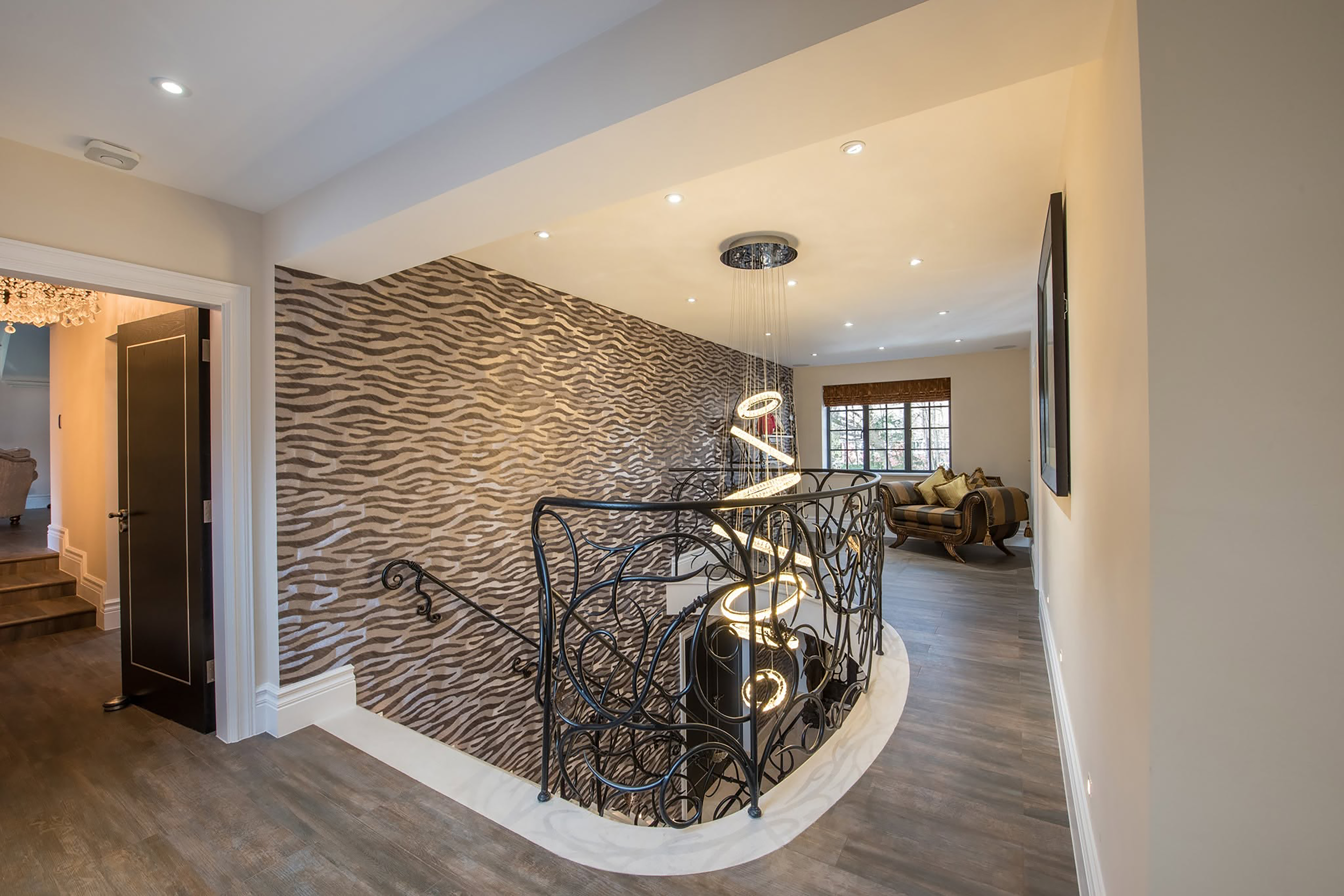
Rooted locally. Designed without borders.
Surrey Design Studio needed a brand that could balance two sides of its ambition. On one hand, it is deeply rooted in Surrey, bringing local knowledge, understanding and credibility. On the other, it is a design-led studio with ambitions that reach far beyond its surroundings.
The challenge was to create an identity that felt considered and architectural without becoming overly corporate or technical. A brand with the confidence to stand alongside larger practices, while retaining the character and accessibility of a local studio.
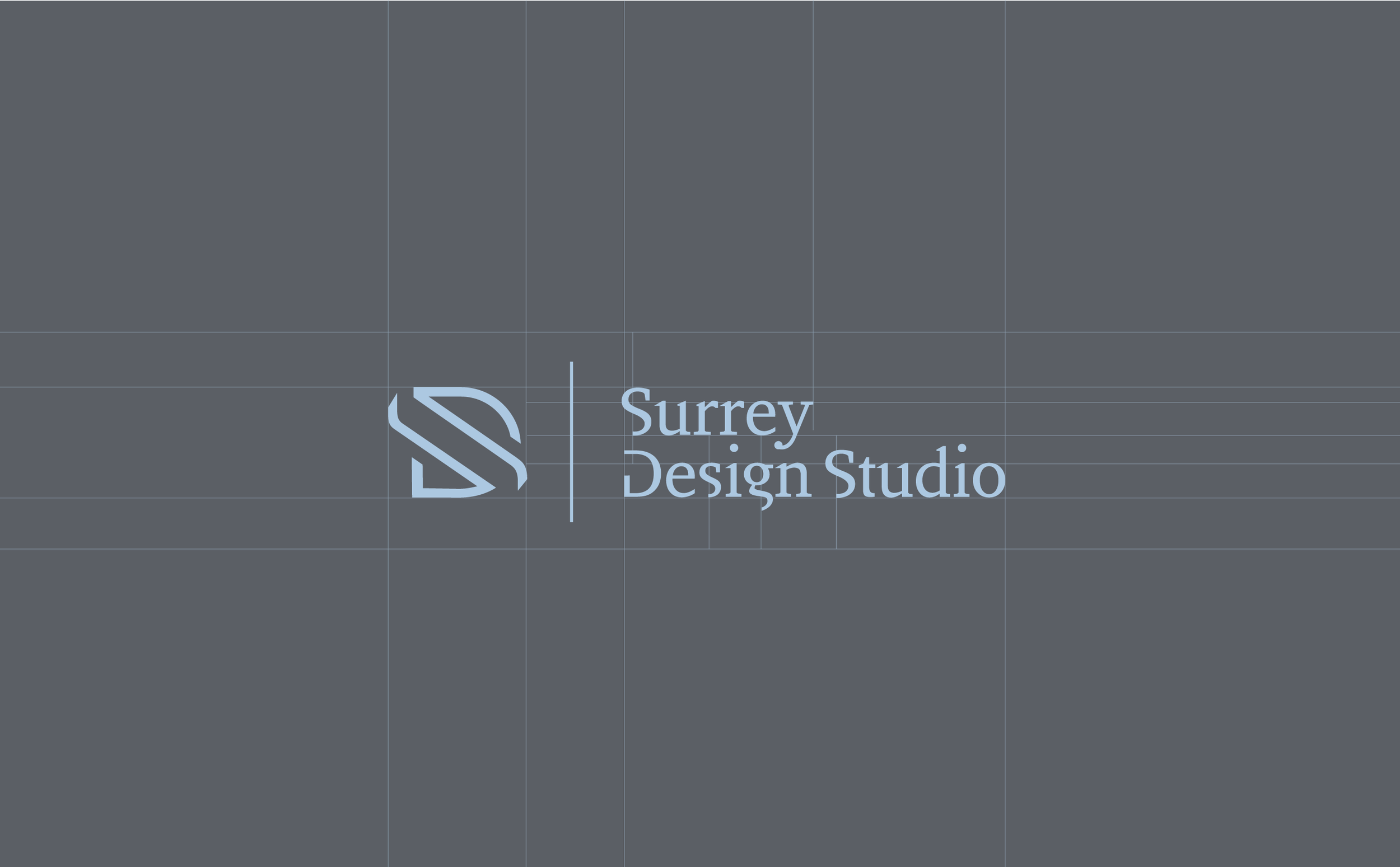
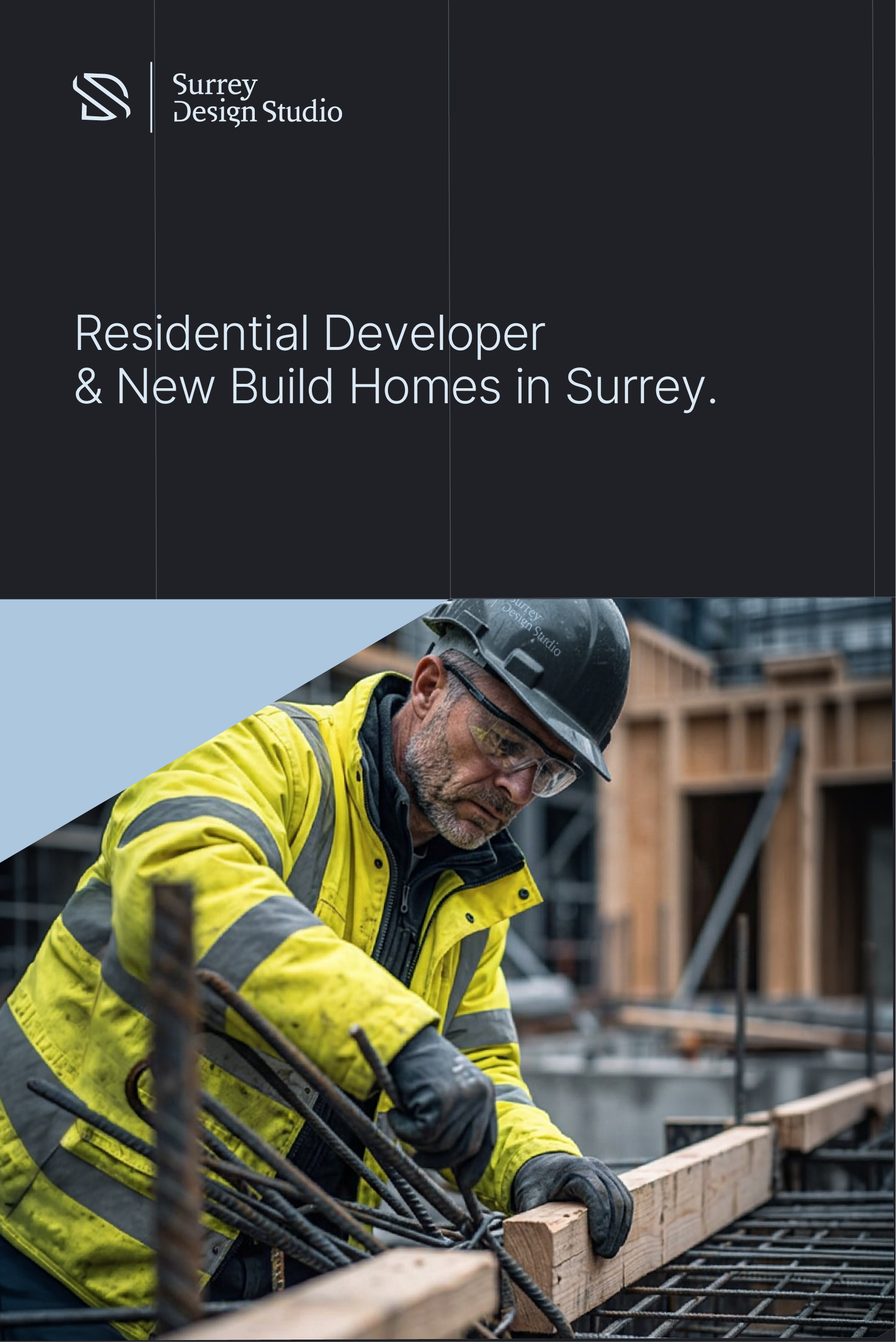
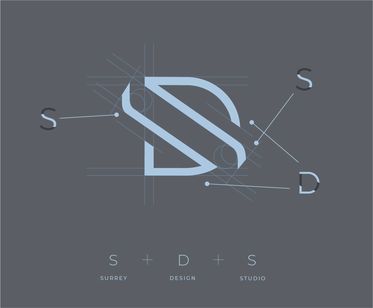
The woven-ribbon logic of the brand mark became the starting point for the wider visual identity. The S and D are brought together through a series of interlocking forms, creating a mark that feels architectural, crafted and deliberately constructed.
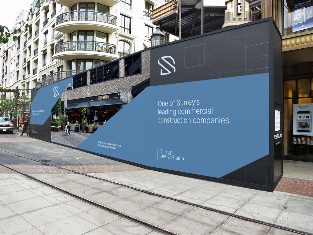
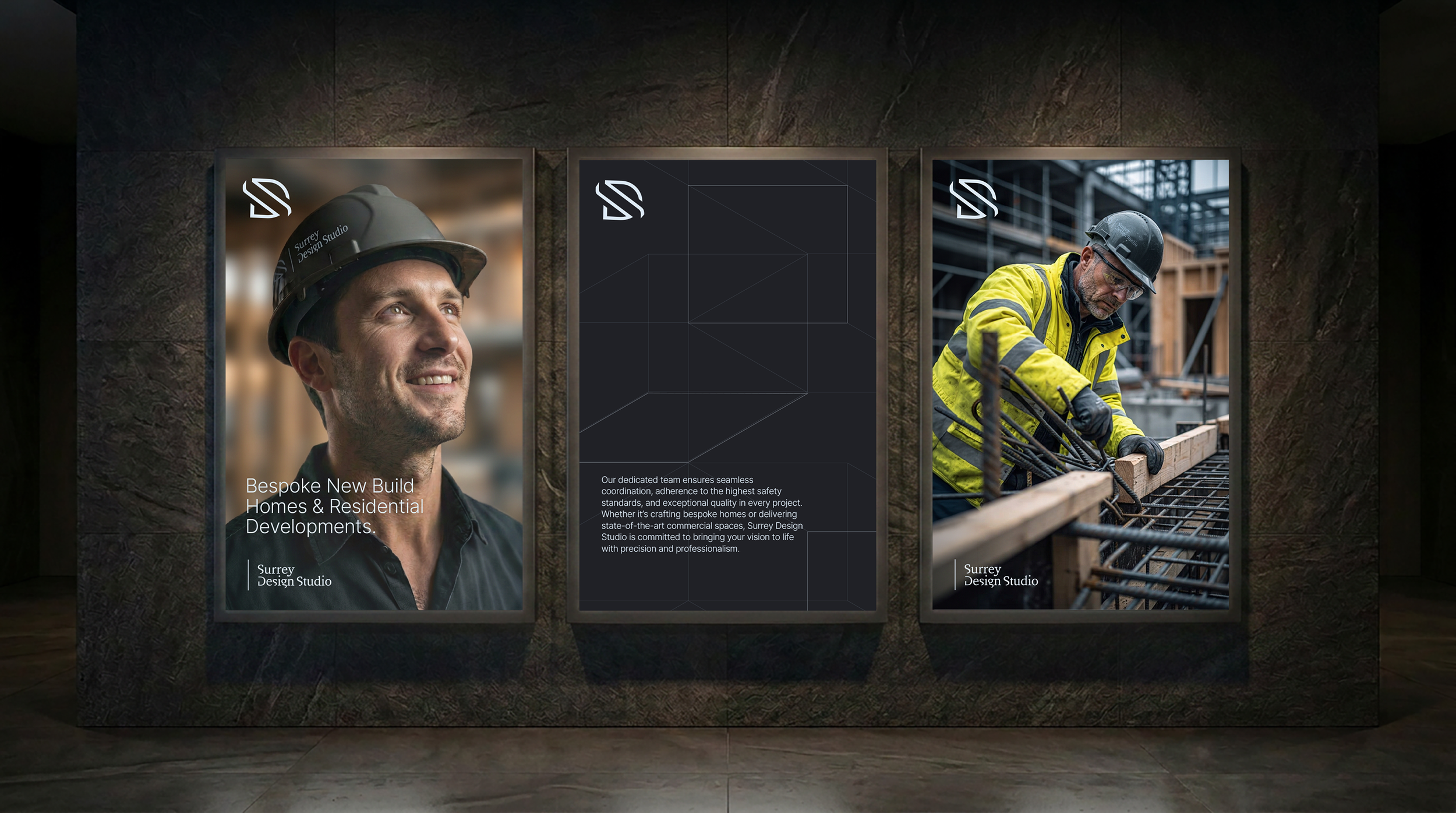
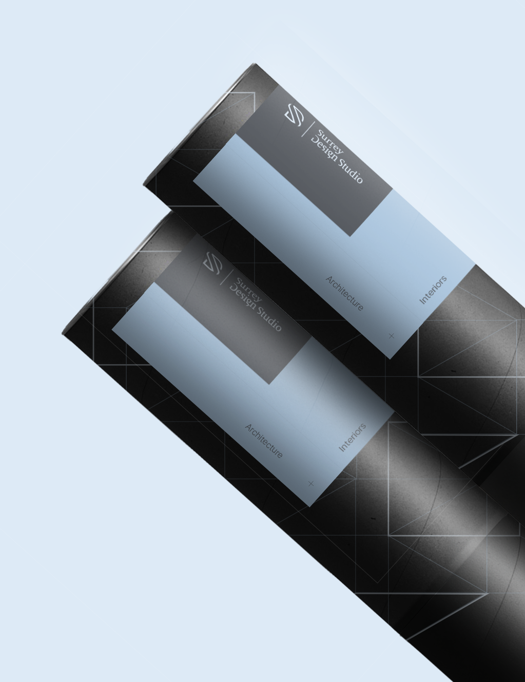
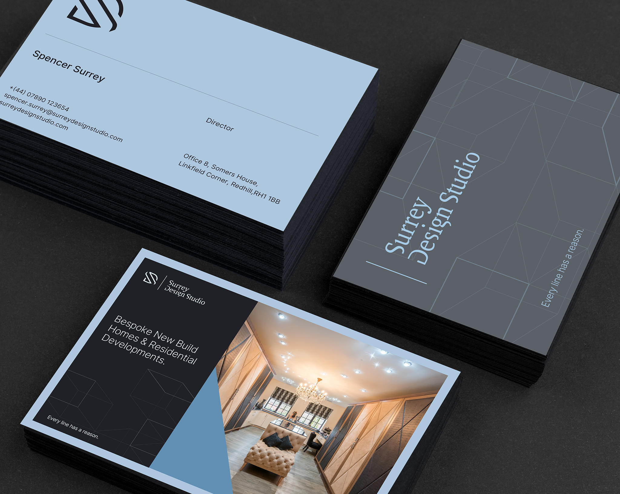
From this, the graphic language was developed using lines, grids and geometric structures that appear to fold, overlap and connect across the canvas. The result is a visual system that reflects the studio's approach to architecture—individual elements coming together with purpose to create something cohesive.
Structure as story.
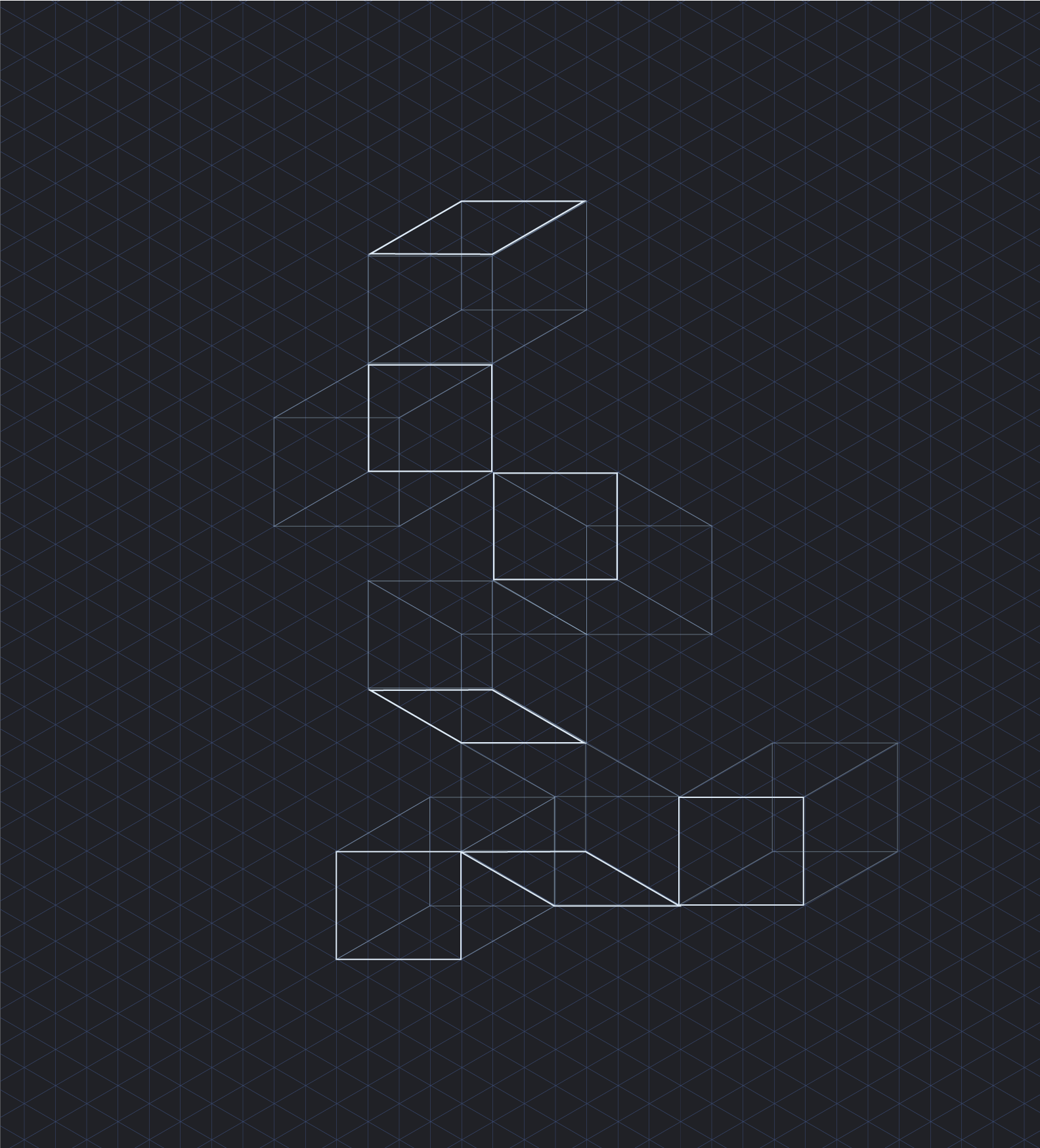
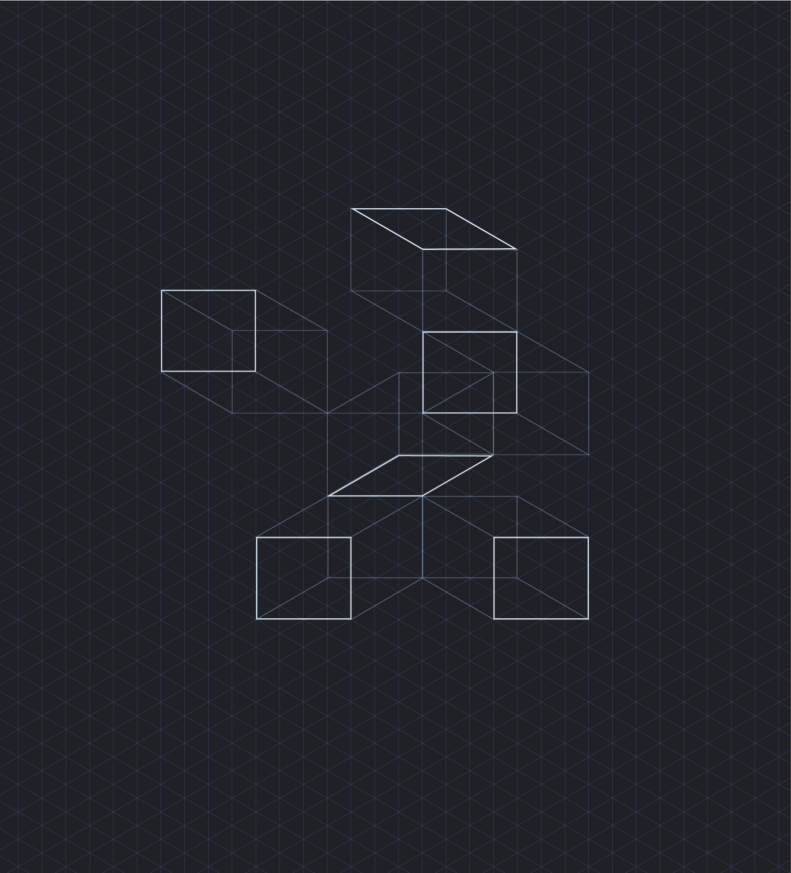
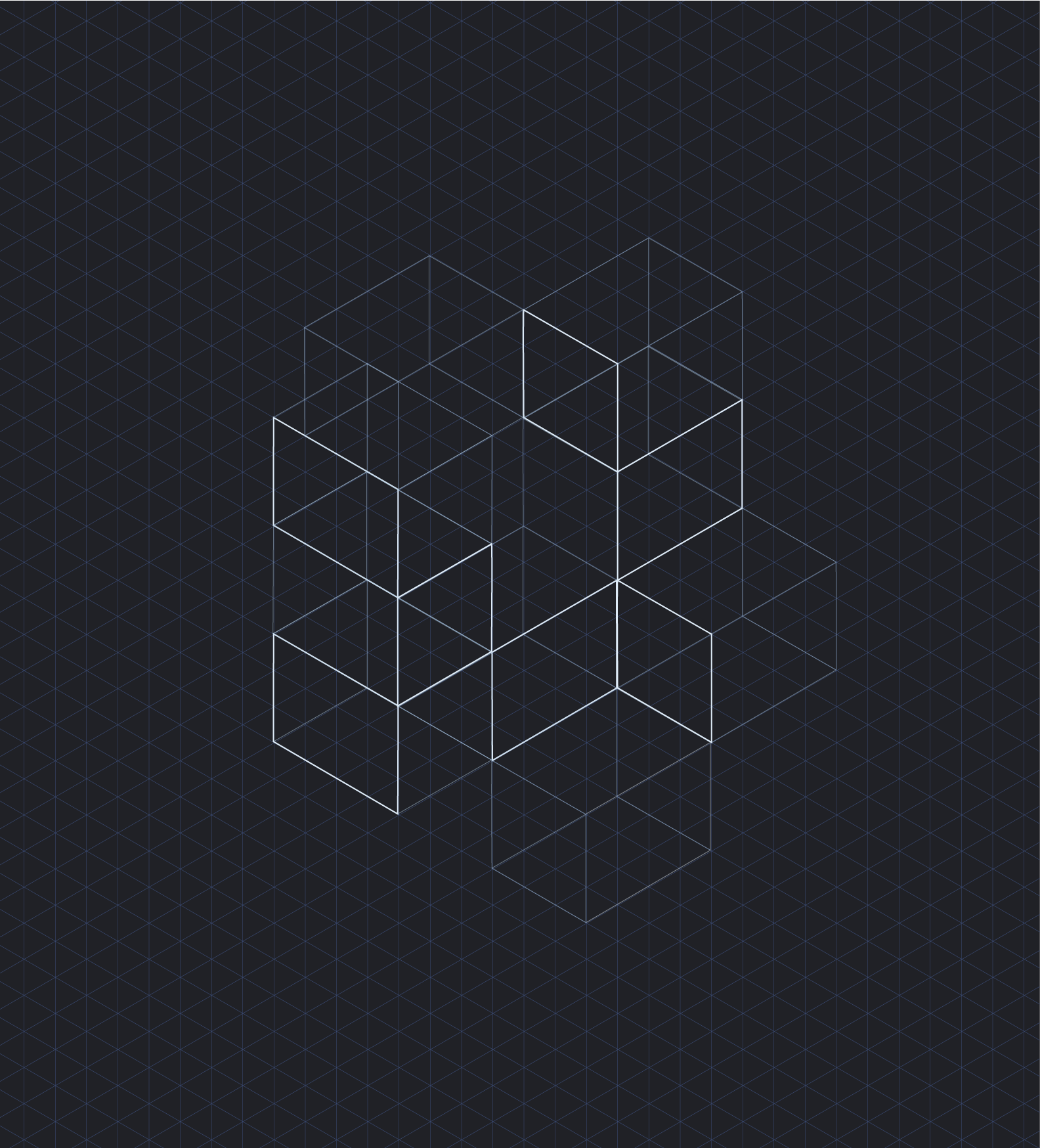
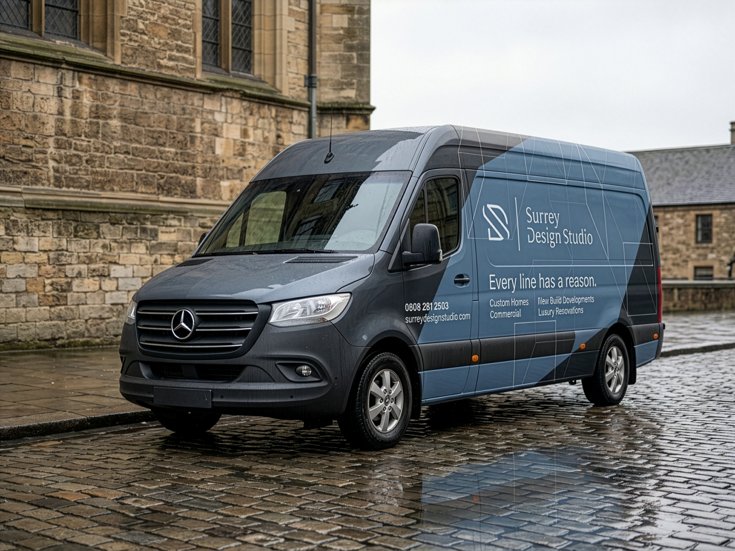
The final identity gives Surrey Design Studio a distinctive platform that feels both grounded and ambitious. A brand rooted in local expertise, but with the visual confidence and design rigour to take on projects beyond its immediate surroundings.
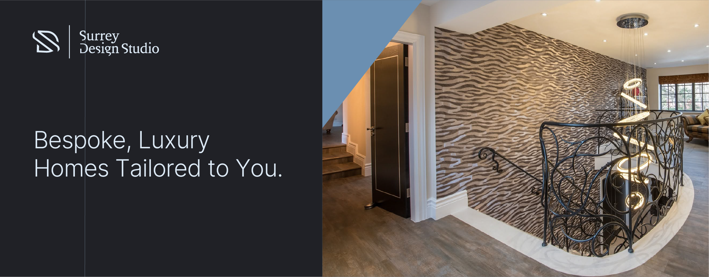
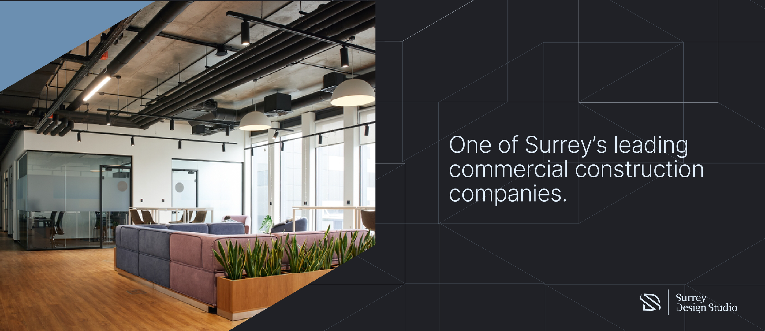
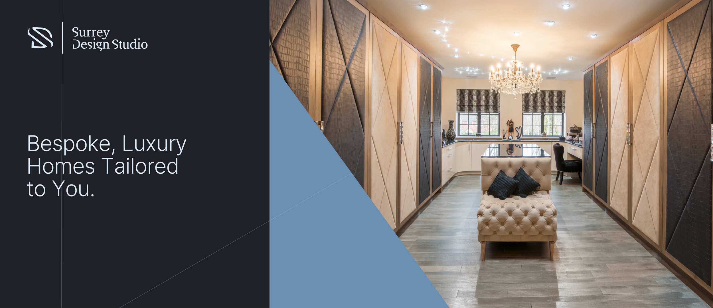
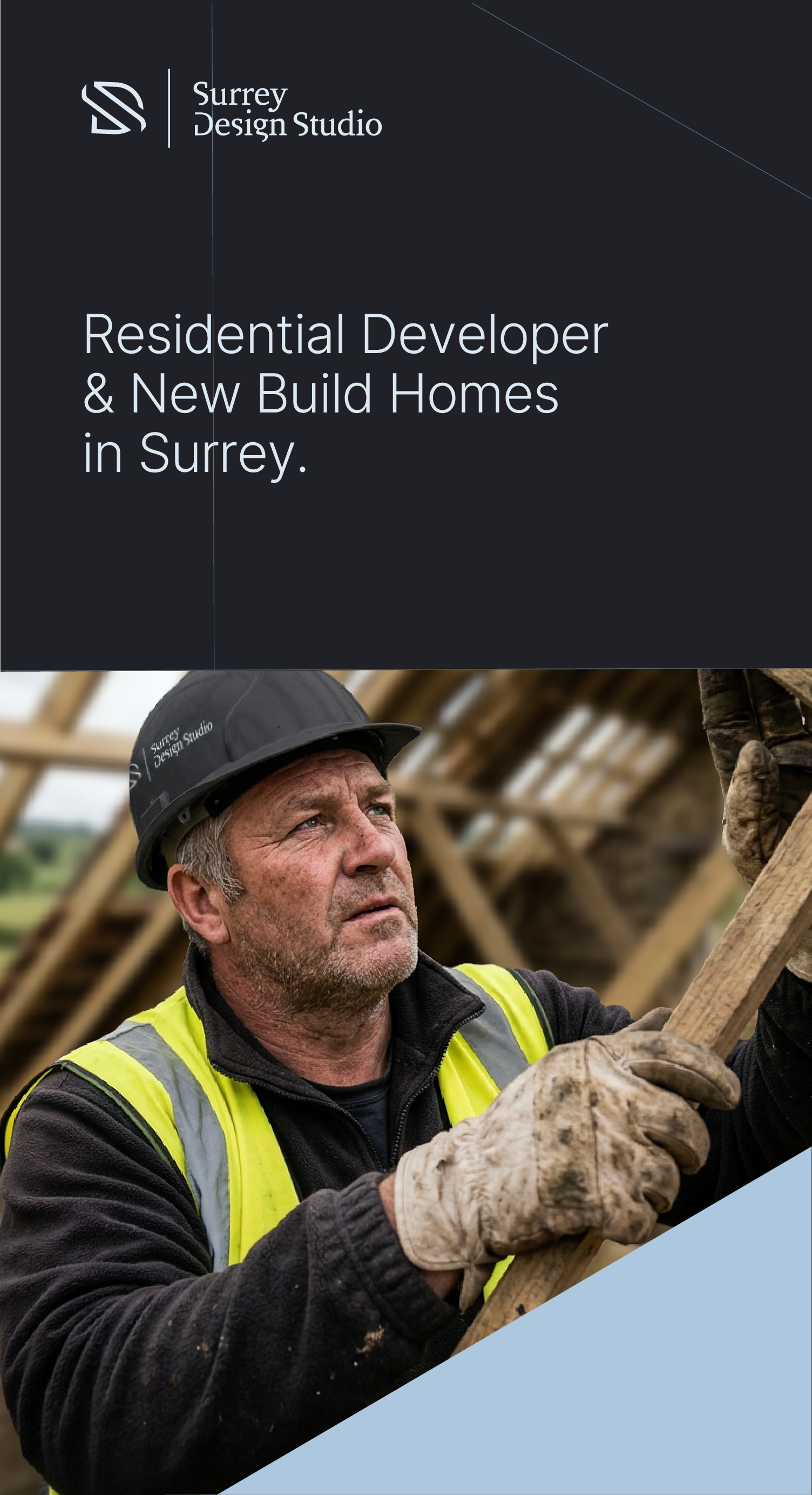
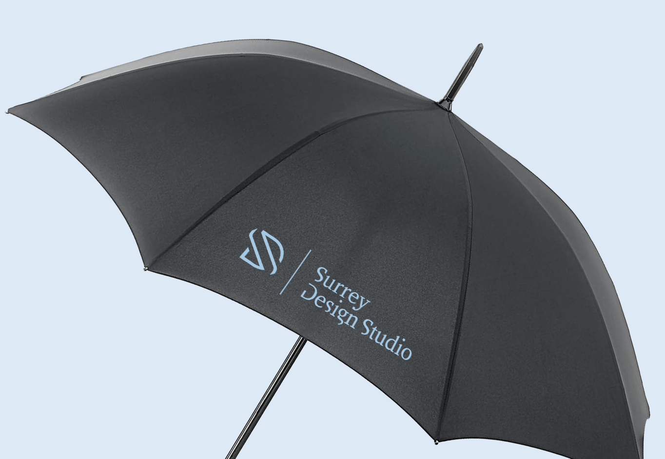
The graphic system creates a flexible language for everything from presentations and project case studies to digital communications, allowing the studio to show not just what it creates, but how it thinks. Because when every line has a reason, every project has a story.
Every line has a reason.
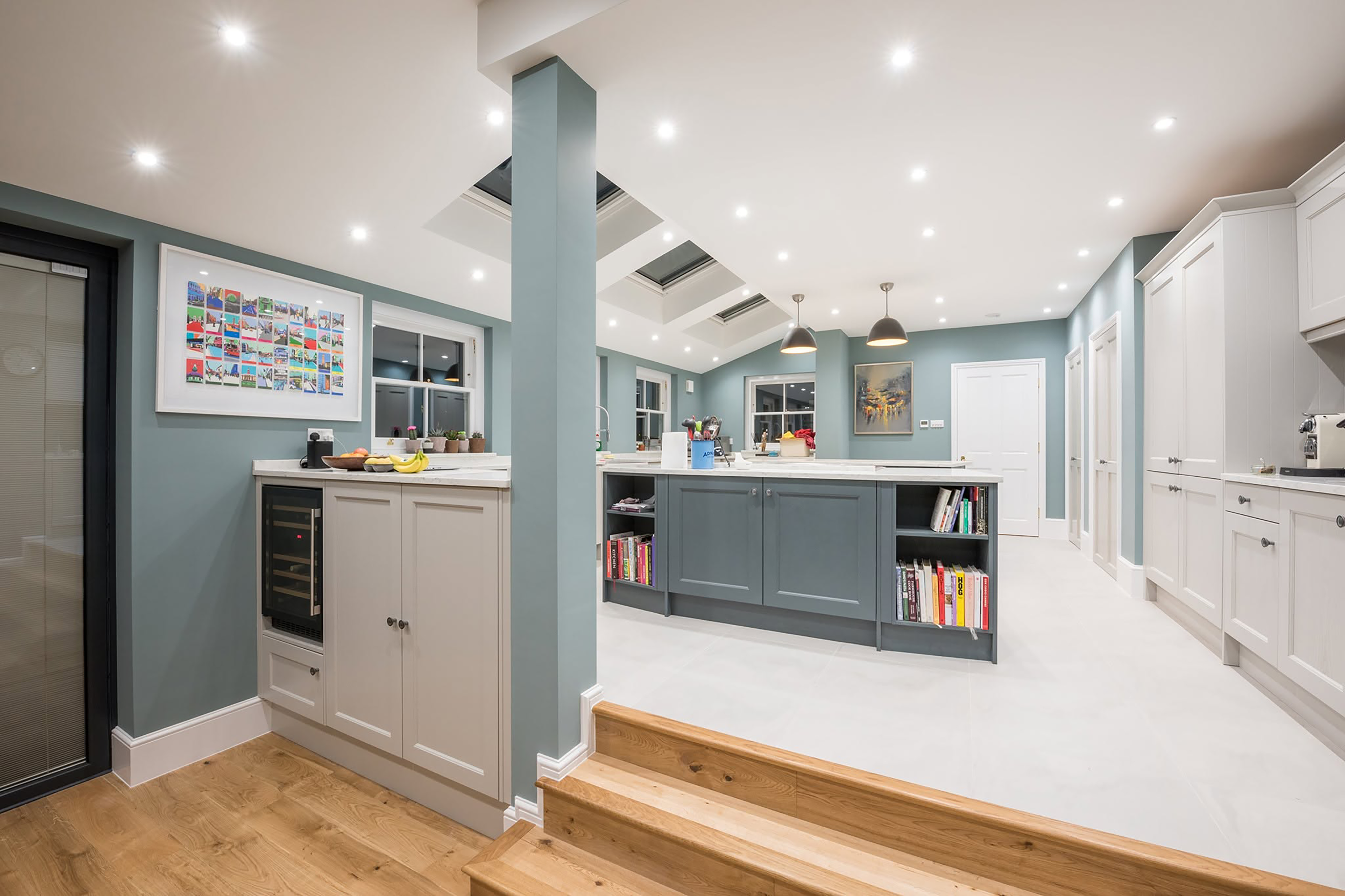
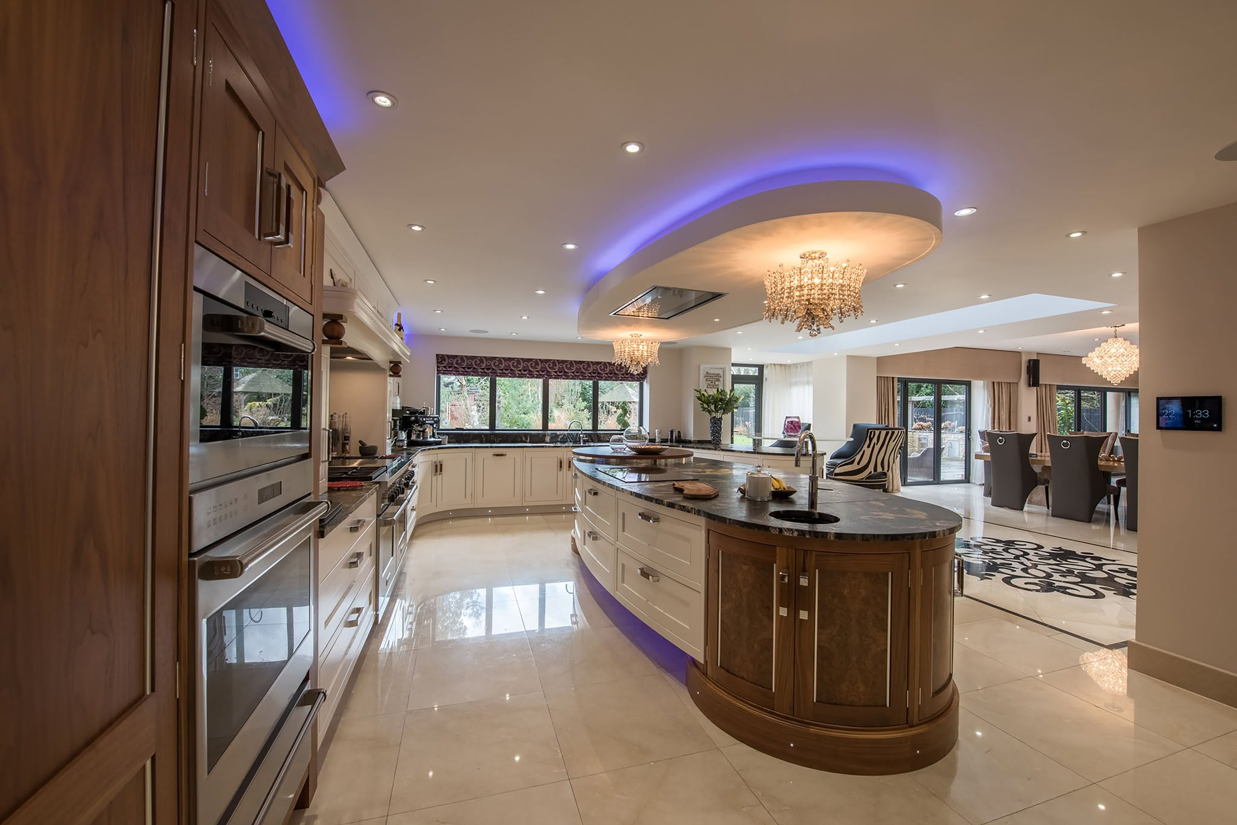

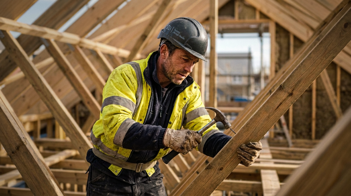
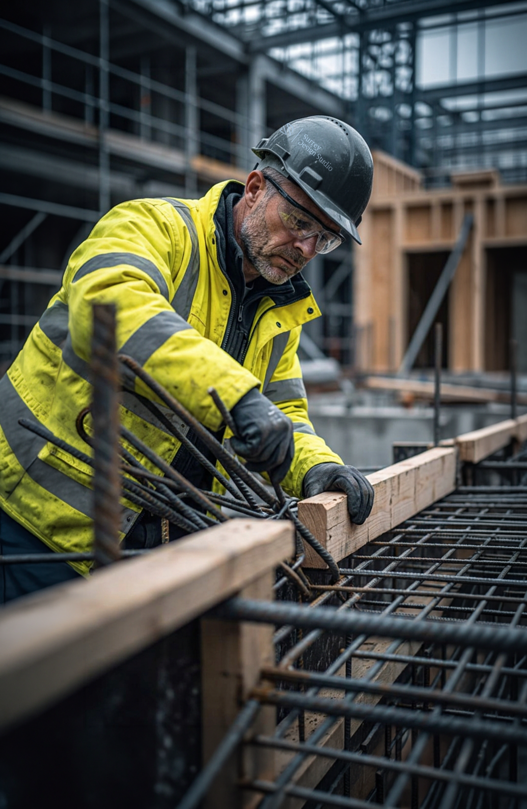


Every building begins with a series of decisions. The site. The client. The materials. The light. The landscape. The practical constraints. Individually, they are lines and layers. Together, they become something greater.
That thinking became the foundation for the brand. The identity explores how separate elements can overlap, connect and ultimately form one considered whole. Every line has a reason became more than a tagline—it became a creative principle for the brand, where every detail and every decision contributes to the bigger picture.
Built from the details.