Selbey Anderson

A family story.
A future-focused brand.
Selbey Anderson needed a refreshed identity that better reflected its role as a private equity group overseeing six creative agencies. The challenge was to modernise the brand without losing the heritage embedded within its name.
At the centre of the project was a personal story worth preserving.

The company takes its name from the maiden names of the founders' mothers. Rather than treating this as a historical detail, the identity was built around it.
The concept focused on connection—bringing both names together within a single, ownable
brand asset.
Two names. One symbol.
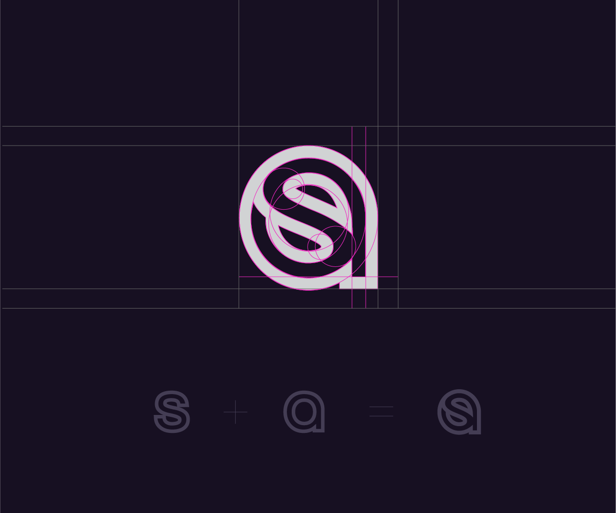

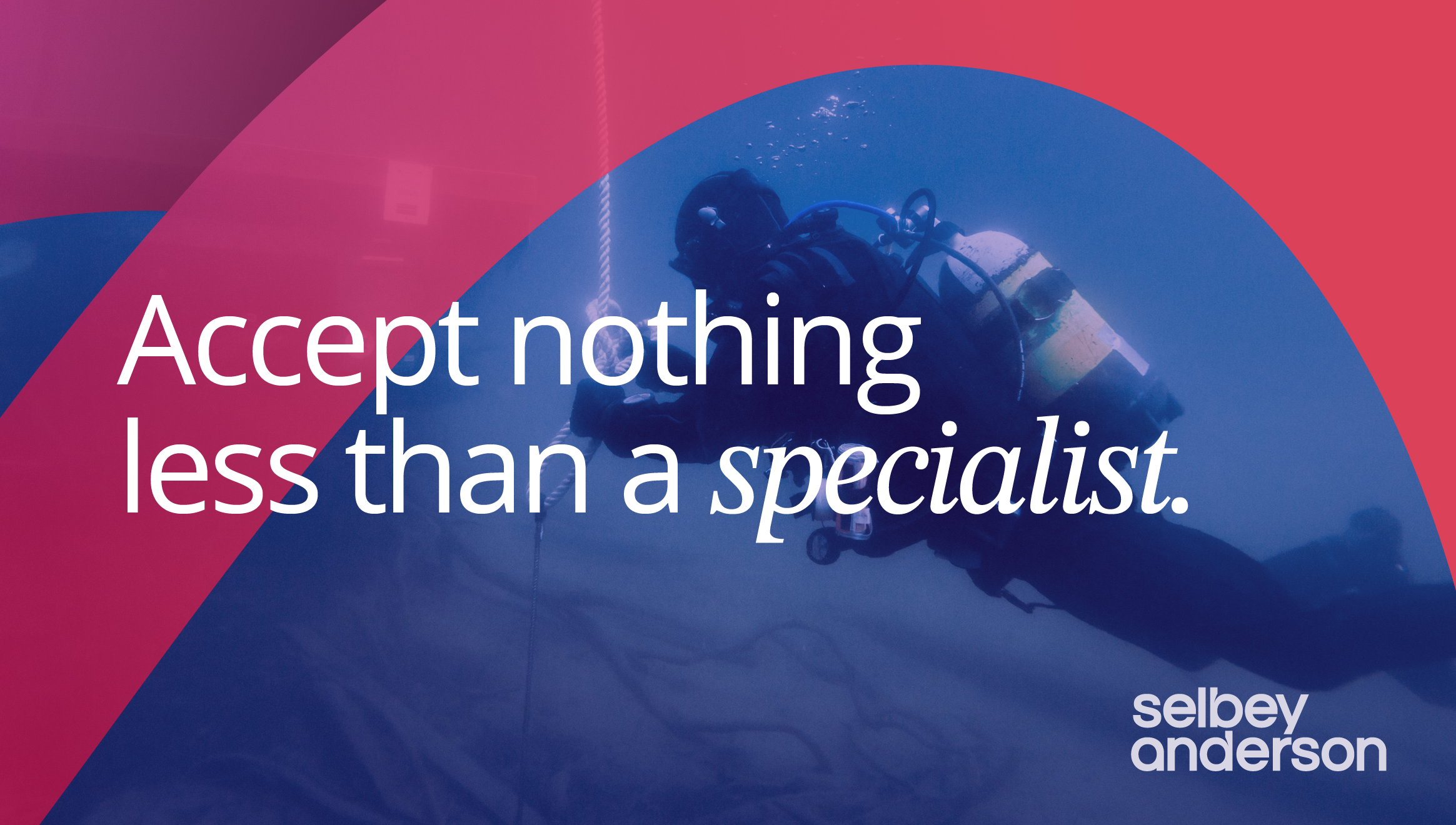
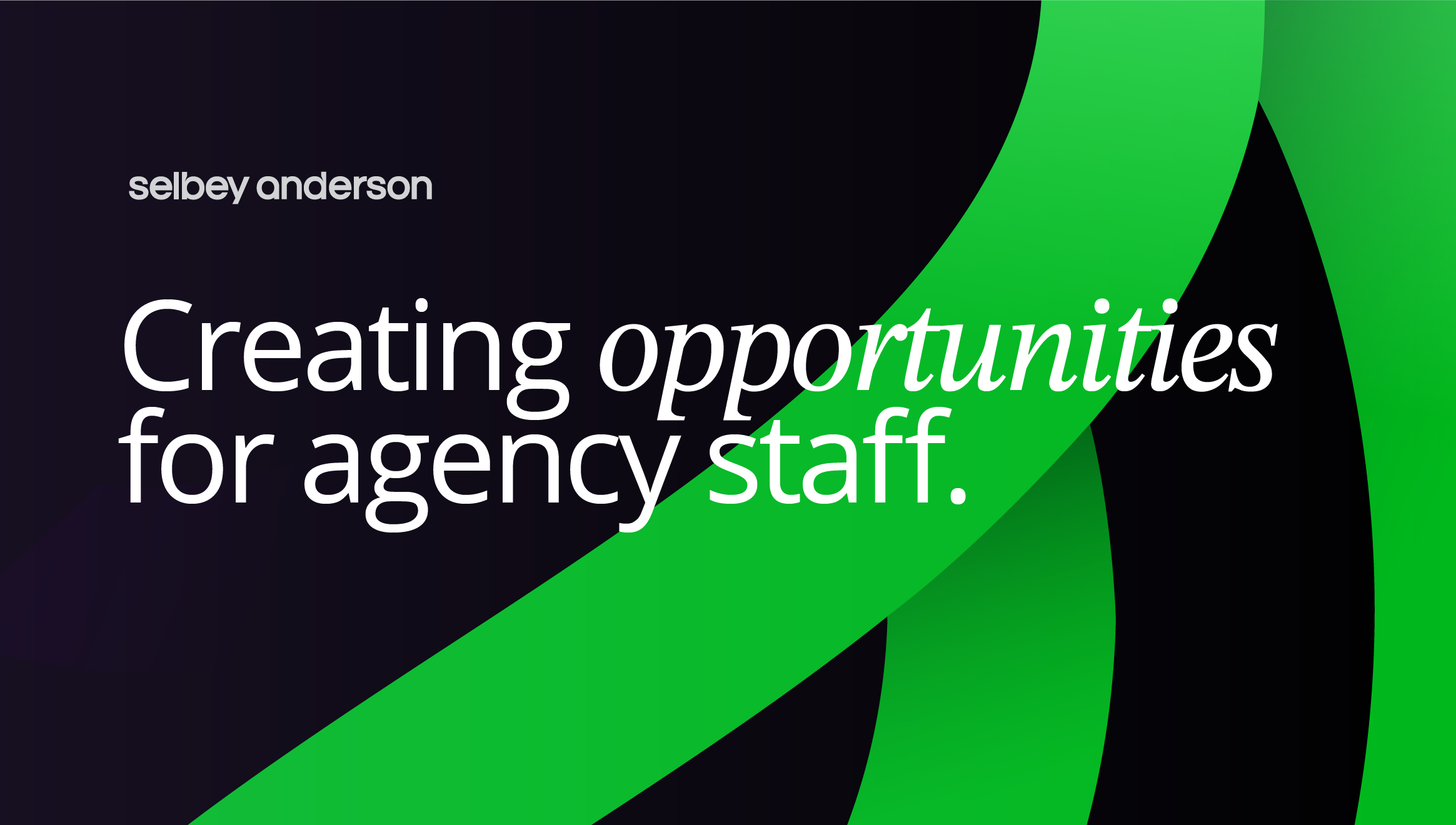
A bespoke monogram combines the letters S and A into a distinctive mark that represents both family names. Supported by a crafted wordmark, contemporary typography and a refined colour palette, the identity balances heritage with modernity.
The monogram also became a flexible graphic device capable of scaling across digital communications and social media.
Heritage, simplified.
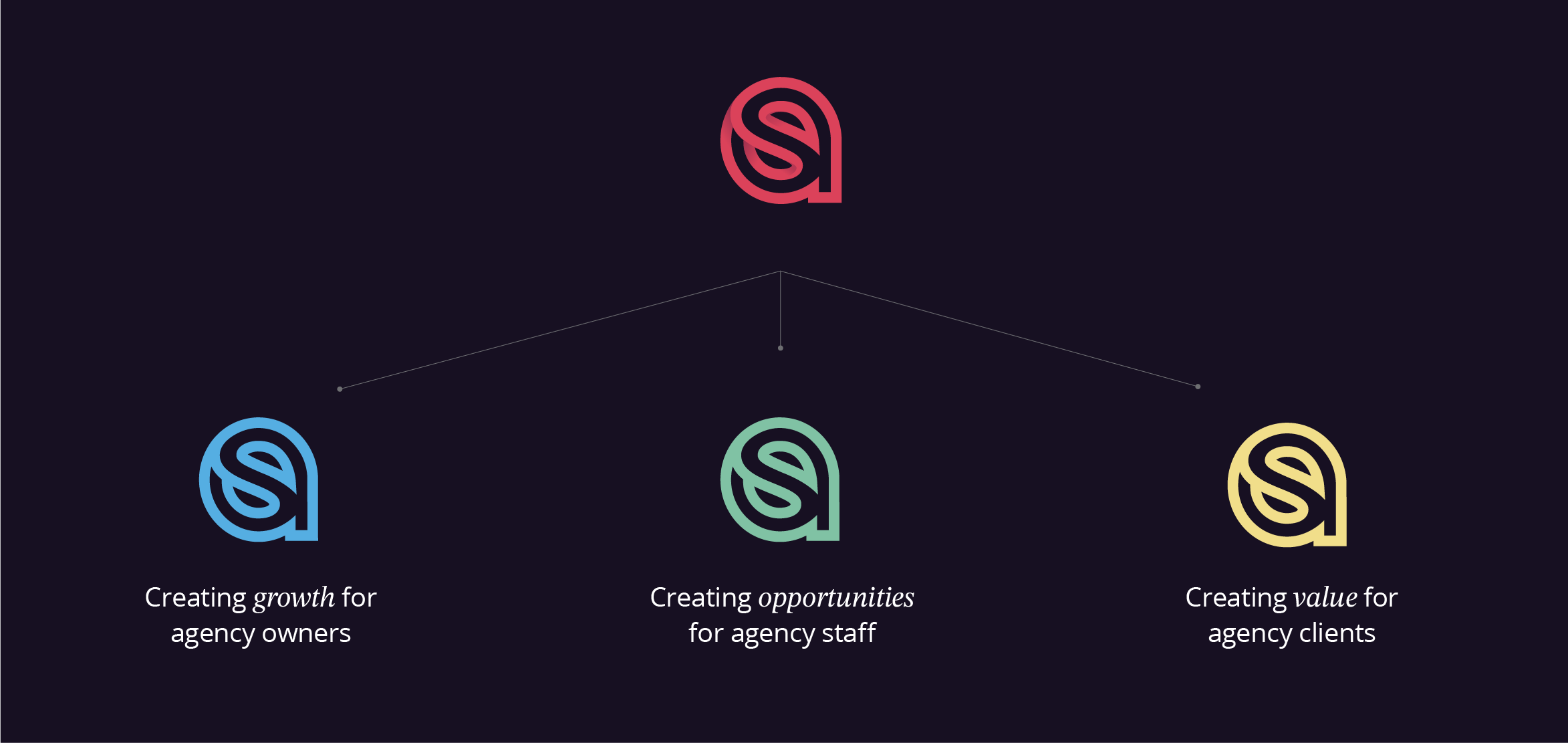




The refreshed identity provides Selbey Anderson with a cohesive brand system capable of supporting its growing portfolio. By transforming a personal story into a distinctive visual language, the brand now communicates both its history and its ambitions with equal confidence.
Built to grow.